|
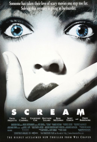
Inspirations/whats going to be usedfrom the scream poster there is a few elements that can and most likely will be used for our poster because of how well they work with the genre and because of how well they work in general. firstly, the main image of the poster although minimal is striking, the extreme close up that clearly denotes the shocked expression on her face is something to consider using with out poster, this is made even more relevant due to the fact that she is shown covering her mouth as though shes hiding a gasp, seeing something that the audience aren't able to see. in other words it raises questions and poses an almost intellectual puzzle to it that almost causes the viewer to continue looking at it.
secondly, the colour scheme of the poster is lacking but effective, the colour scheme has connotations of the horror movie genre whilst also working with the main image and the layout. the title of the image is in a bold white, a colour that within the horror genre has similarities to supernatural elements as well as purity. although here its almost been used to create the effect of making the main image look like shes ghostly pale, as though something shocked the very should out of her. her skin stands out even more when its contrasted against the blue of her eyes, the only element (including the bottom text) within the poster that actually has colour to it. thirdly, the typography is quite inspirational also, its plain but this could be done for the specific purpose of standing out against the typical cliche typography of the time that would perhaps often involve blood dripping from the letters or the text being overly bold. its simplicity could be something useful when creating our title. also, there is the fact that although it is plain the rest of the text surrounding it is nothing like it, the rest of the text is similar to serif font and more professional looking than the bold, stand out title and so it makes an attention grabbing affect to it, even if it is minimal. |
Film Title:
Scream
Genre:
Thriller
release date:
December 20th 1996
director:
Wes Craven
info:
scream is an american thriller/slasher teen movie. its success has made it into a franchise with four successful films following after this first one, with its film revenues within the box office totalling somewhere near 100-500 million.
production company:
Dimension films,
corvus corvax
Konrad Pictures
Outerbanks Entertainment
Cast:
Dave Arquetter
Neve campbell
Courtney Cox
Matthew Lirrard
Rose McGowan
Skeet Ulrich
Drew Barrymore
short summary Scream (1996 film) Scream is a 1996 American slasher film written by Kevin Williamson and directed by Wes Craven. The film stars David Arquette, Neve Campbell, Courteney Cox, Matthew Lillard, Rose McGowan, Skeet Ulrich, and Drew Barrymore.
short synopsis: Scream is at once a slasher film as well as a parody upon the teenage horror movies of the 70s, many of the conventions in the movie stick quite openly to the normal stereotypes of teen-horror movies. main character sydney prescott is still distraught and haunted by the killing and rape of her mother, and now one of her friends have been killed by a deranged scary, film fanatic, knife-wielding masked killer who is now out to get her also. she must try to figure out who he is and stop him before he picks of her, the final girl.
Mood- this poster seems to be creating the mood of dramatics and shock, more than its creating the mood of fear, the poster doesn’t hold as much danger to it as most movie posters do. the character denoted on the poster could have this facial expression from being shocked by her realising she slept in late as much as she could from being met face to face with the killer. Her mouth doesn’t appear to be within mid-scream or calling for help. Rather just a gasp which can be the response to a lot of things, not just a killer, the expression can’t really be mistaken for a scream as the woman just doesn’t have her mouth wide enough to scream, even with the fact that half her mouth is covered. Her face isn’t dramatic enough to be screaming. However, perhaps the effect that was supposed to be created by this is shock, shock that could come from a number of things such as discovering a dead body. Moving on to the colours and camera angles used in the poster there’s the fact that the woman’s face is in an extreme-close up shot, meaning that she takes up the whole area of the poster, she is the main focus and her expression is something that sticks in the mind. In addition to this the colours used are rather sticking and bold, most of the poster is black and white something that most horror movie posters do, the woman’s skin looks ice-cold almost dead, as though the blood has been drained from her face, like a corpse except for the fact that her face has an expression on it and the fact that her eyes actually hold colour to them. They’re ice blue, once again building connotations of death (as bodies go ice-cold during death) as well as making her eyes have a depth to them that’s yet to explored.
Setting- there is no setting to this poster, perhaps that’s done to add the effect much like the saw poster where nothing is given away about how the movie actually looks, and where it takes place. Thus it leaves the audience wondering and questioning.
Iconography- there is quite a bit of iconography on this poster in the form of typography, for example the tagline of the poster is quite long. It actually gives an idea of the plot and what the movie could be like, i.e. the typical stereotypes of horror movies will mostly be involved. It does follow a theme to it with white, black and icy blue running throughout. As well as this there’s the fact that most of the character’s names are involved, perhaps because they hold star power to them that will make the audience want to see the movie. As well as the director holding some star power to him as well (he’s mentioned at the bottom) people would have heard of most of these characters and the director so their expectations are set quite high for the movie, they’ll want to see what wes cravens latest work with these stars has produced.
|
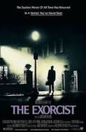
Inspirations/whats going to be usedanalysing the exorcist poster there a lot said about it that can be inspiring to our movie poster as well as just liked because its a good quality. for example, the main image is something that holds so many aspects to it that instantly hold meaning to it, or get the audiences mind thinking just why this is an included element within the image. the bright light streaming out of a single window is just one example of this, it creates an ominous and thought provoking effect, the white light is a ghostly, pure and god-like white that usually connoted with ghostly and spiritual entities. it shines down on this lone figure a man who seems to just stand there and bask in the glow, not exactly afraid but the fact that hes still in the picture does connote the idea that he isnt exactly open to just entirely going forth towards it. also the fact that the white light stands out against the almost pitch black of its surrounding and even against the rest of the lights that are shown glowing at the normal intensity makes this affect even more powerful, it definitely signals to the audience that this white light is not normal its something incredibly powerful and therefore most likely threatening, it instils the fear of the unknown within the character.
as for the other aspects of the poster they aren't quite as inspiring, they're rather normal and typical although the colour of the film title does stand out against everything else. also purple is also said to represent mystery a factor within this movie thats largely explored as the audience wonder whats going to happen next. perhaps within our movie poster we can focus on using a colour scheme that has colours in it that can create the desired feeling within the audience. |
film title:
The exorcist
genre:
supernatural/thriller
release date
march 16th 1964
director
William friedkin
info:
the exorcist is a supernatural thriller movie based on the tale of 'true events' with which a girl was possessed. it is the first instalment within a series of films, it was adapted from a novel written by William Peter.
production company:
warner bros.
Hoya productions:
Cast: Ellen Burstyn Max von Sydow Lee J. Cobb Kitty Winn Jack MacGowran Jason Miller Linda Blair Mercedes McCambridge
short summary:
The Exorcist (film) The Exorcist is a 1973 American supernatural horror film. a 12 year old girl (close to hitting puberty) starts playing with a ouija, soon after she begins a friendship with an imaginary friend called captain howdy. soon after this her mother notices her behaviour becoming more and more erratic, when Chris's friend (Chris is the mother) finds one of her friends killed after babysitting Regan. the police get involved and one officer suggests calling a priest/psychiatrist, Damien Karras and exorcist father merrin. the two venture to expel the demon from her body.
Mood- the mood created by this poster is quite ominous, there is quite a few aspects to the poster that give an overall idea of what the movie is about. There is the denotation firstly of a setting, there is a place that can be scene and assumed to be one of the place or the place that the movie takes place. It’s a house which within horror movies has many connotations to it, houses can be haunted by an evil entity, usually people are supposed to feel safe and secure at home but within horror movies they meant the exact opposite with people often being trapped and in danger within the confined space of a home where no one can see what’s going on unless it’s through a window, and that has almost never happened within a horror movie. To extend on the idea of windows, there’s the fact that there’s the denotation of a pure white and brilliant light illuminating a man standing at the entrance to the house, whilst he’s also standing next to a street lamp yet the light in the house within this one room is stronger than that light purely hitting this man and almost nothing else not even the pavement behind him. This light can therefore be assumed to be ghost like or have connotations of something paranormal and not from this world as it holds more strength to it. There’s also connotations that come with someone looking directly into light, for example there’s a myth of people seeing a bright blinding light right before they die and they walk towards it and towards death itself. This man (perhaps a working man due to his case, long coat and hat) is facing that light so it can be assumed that this man is going to walk right to words this supernatural entity, this light that could represent death. In addition to this there’s the fact that the man is rather small upon the poster, and whilst this could suggest his insignificance there’s also the fact that he’s the only human thing on the screen, the only character on the screen which actually could reinforce his significance. The colour scheme much like other horror movie posters is a basic black and white (most likely because they have connotations of light vs dark, good vs evil etc.) alternation however there is the fact that the title is a striking yet pale purple which is sad to have connotations of mystery, magic, power and within Thailand it also has connotations of mourning i.e. death. This could also have been done so that the audience see the striking title of the poster within the pitch black and white.
Camera angle- the camera angle is a wide establishing shot denoting the setting and the single character, a man. This could be done because the audience can therefore get the assumptions of the fact that the house is not like a normal house, it has something within that’s powerful and perhaps scary judging by the fact that its clearly in-human, shown by the fact that this one window (from upstairs most likely a bedroom) this one room holds something great within it, something that’s greatly evil due to the fact that the movie is within the horror genre.
Typography- the typography of the poster is quite typical with its denotation of of the title, tagline and credits, although the thinness of the credits could be intentionally done so that the audience don’t focus on it. And rather have more important things focused on such as the tagline that is largely impacting, claiming to be one of the scariest movies of all time, this definitely creates the effect of anticipation and most likely fear within in the audience.
|
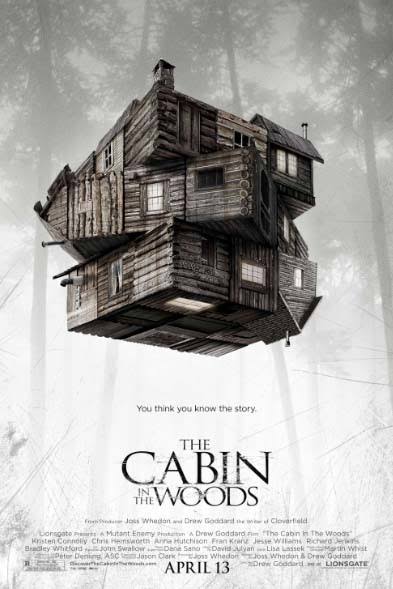
Inspiration/whats going to be usedthe cabin in the woods poster doesn't exactly have many elements to it that would be too inspiring to our movie poster, to a certain extent its typical although once again as with the other posters prior to this the main image is something that's particularly likeable about this poster. the main image is attention grabbing to say the least, a floating, rubix-cube like cabin in the middle of ominous looking woods with trees that seem to never end is something that is very inspirational. the cabin has many connotations that can be thought by each individual member of the audience, one of them being the fact that the world itself in this universe with this cabin in the woods that is sure to hold doom for all that go there turns whoever's life upside down at the drop of a hat, trapping them and not letting them go like a maze. this is made even so due to the fact that the cabin itself seems to be floating which definitely builds the idea of it not being a normal everyday cabin, like a ghost it seems to be hovering there.
besides from this the rest of the poster is rather mediocre (the colour scheme is not bold or majorly striking its a pure white with a black/brown mixed with it that makes it slightly drab and boring) besides from the typography of the text/. the text is actually quite inspirational the scratched wood effect holds a lot in common with the cabin as its made out of wood also, almost as someone has carved these very words into the wood. perhaps my poster can take this approach of making sure the typography holds some similarities to the main image. |
film title:
Cabin in the Woods
genre:
horror comedy/thriller
release date: april 13th 2012
director:
drew goddard
info/short summary:
cabin in the woods is an american horror Comedy depicting a group of teenagers try to survive being killed as a group of devoted people sacrifice them one by one in a isolated location as part of a supernatural ritual. This specific version of the film is an adaptation from its predecessor, hence the Tag-line.
production company:
mutant enemy productions
cast:- Fran Kranz
- Jesse Williams
- Richard Jenkins
- Bradley Whitford
short summary:
Five teenagers head off for a weekend at a secluded cabin in the woods. They arrive to find they are quite isolated with no means of communicating with the outside world. When the cellar door flings itself open, they of course go down to investigate. They find an odd assortment of relics and curios, but when one of the women, Dana, reads from a book, she awakens a family of deadly zombie killers. However, there's far more going on than meets the eye.
Mood- the mood created by the poster is one that’s very, very twisted. Most likely because of the fact that it needs to take a new approach since the movie has been made before and people have become familiar with the story, the jump scares and what should be the fear factor that the move holds. The house may be twisted because it’s trying to get the message across to the audience that this version of the story is far more twisted, shaken up and re-made. Further extending upon the house there’s the fact that the house is almost like a rubix cube with what should be up being down and what should be down being up as though the whole world has been turned upside down, which is the way the characters feel once they enter the cabin and start to experience the strange events. It’s quite unsettling really even with the fact that no characters have been denoted, the floating rubix cube house has enough of an impact to show that what occurs within the movie is far from normal or human-like. The colour scheme isn’t quite like the typical movie poster, most of its in colour, mostly the cabin however the background seems to fade in to what is the woods that the cabin is in its almost as if the cabin is within a different world, realm and dimension entirely, a ghostly dimension that holds terrible things.
Typography- there isn’t much aspects in the terms of typography to this poster, the credits are small and so is the Tagline. Although there is the fact that I can assume that this was done to create the effect of most of the audience’s attention being drawn to the Title of the film, most likely because the film holds a lot of strength to it within the title because of its predecessor. As mentioned before there isn’t a need to guess the situations and plot of the movie because it has been done before. However this being said the tagline does make the audience question if they really and truly think that this version will be the exact same. In addition, there is an aspect of the iconography being slightly chilling as the Title is written in a font that’s almost similar to perhaps something being engraved in wood and then scratched out, which is amplified by the fact that cabins are made out of wood, The title looks more effective because its unpolished style.
|
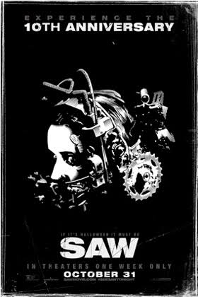
Inspirations/ whats going to be usedthe saw poster much like the cabin in the woods poster holds some elements to it that are inspirational and others that are cliche and perhaps over used in the horror genre, for example the fact that the colour scheme of the poster is black and white is something that is overused and cliche and will not be used in our poster, even the title of the movie follows the colour scheme meaning that it doesn't stand out by itself, even with the extra bold effect and the slight change of typography with the scratched effect it still doesn't stand out by itself the way it could if it was a different colour. although, this being said there's the fact that the simplicity of the colour scheme is diverse in its use, they compliment each other and can still be used when they feature on things such as magazine front page, meaning that people can build up a sort of familiarity with it. when people see black and white they may think of the SAW franchise. this can inspire our poster in how the colours are unique enough that over time with increased exposure people will instantly think of our trailer.
besides from this as always the main image is the main factor of this poster as with the other ones. the character is shown as a floating head type being (although its obviously a human, or is it?) thus it takes away from their human quality. they don't have a body they're just a floating head, they could be dead or alive (the expression on her face could have been frozen there just before death) we don't know where they are, there's a lot of intellectual puzzle qualities about this poster. also, the expression on the characters face provokes a sort of unsettling feeling within the audience also. her absolute fear struck demeanour reflects on the audience and almost intensifies more and more as you look at the fear in her eyes and the absolutely terrifying and menacing contraption on her head. this can be inspiring for our poster, using an image that pretty much gets worse and worse the more that you look at it is something to greatly consider, the minimal approach is effective as it makes the sole focus of the audience go straight towards the image. |
