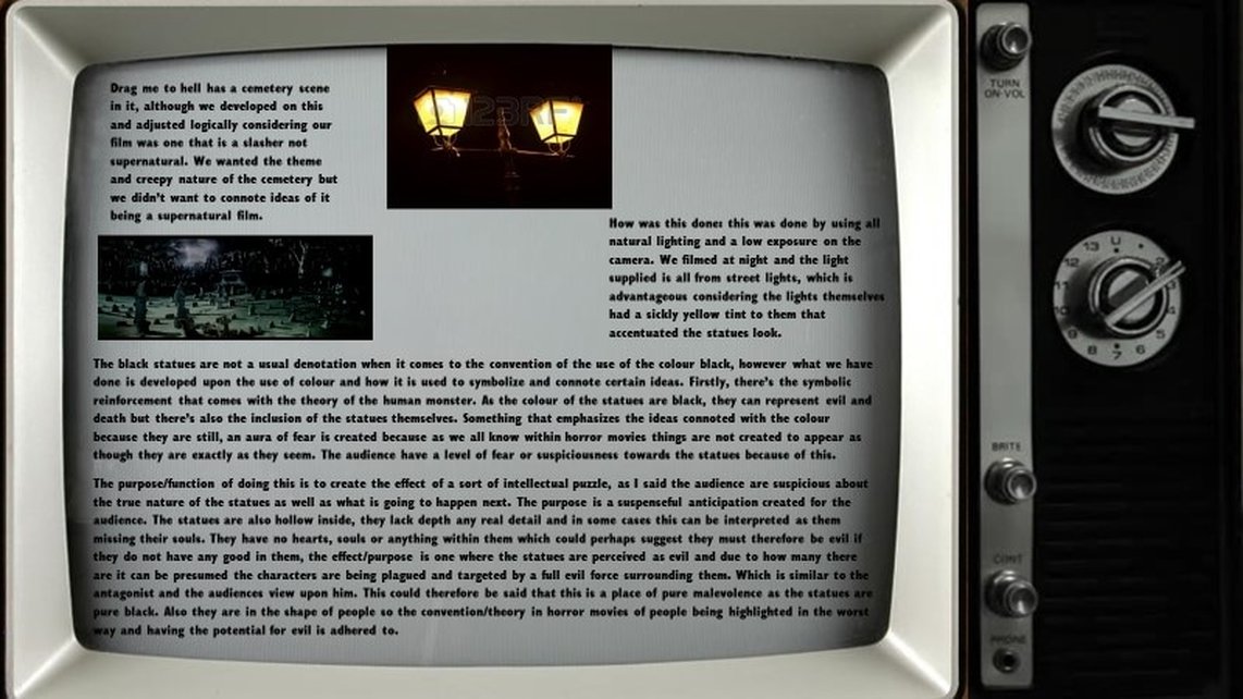
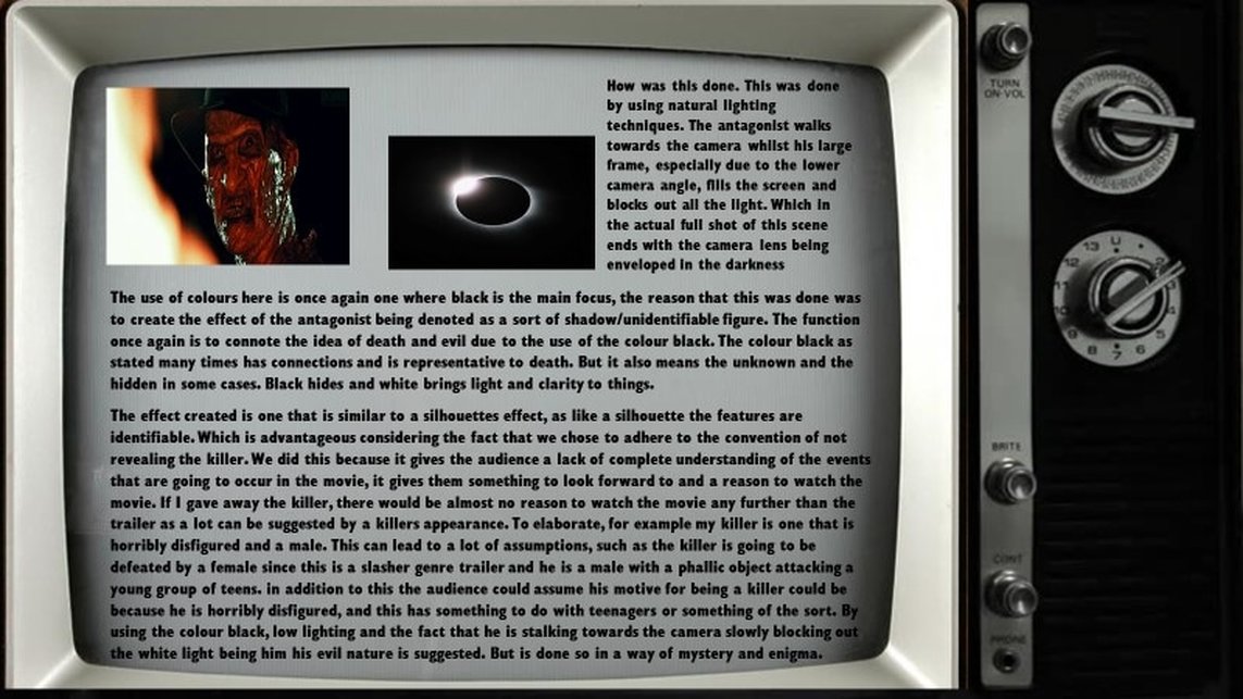
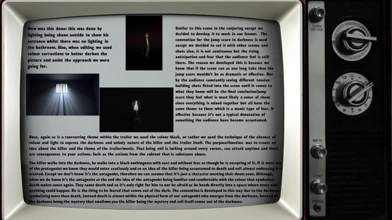
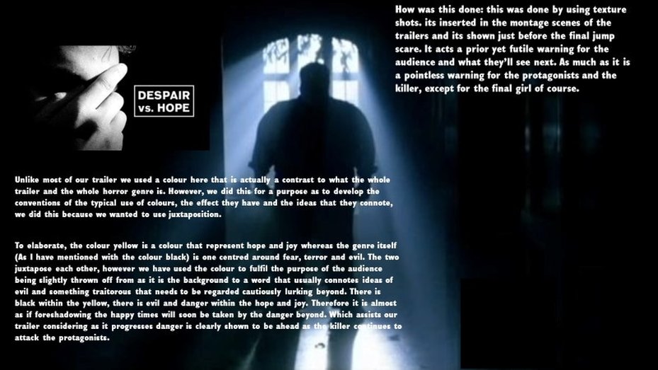
Within the horror genre there are the conventions that exist within and around structure/narrative certain structures exists, or rather belong in media texts most of the time. Throughout the development of film a clear majority of the texts have adhered to a certain format or layout, and by doing this they have created a common convention or expectation within the audience. Although, as most things do this has also been developed and challenged regularly to create certain effects. For example, within our trailer in regards to the structure of equilibrium, disequilibrium and resolution, a typical conventional factor that exists within most real media texts, we developed this convention. To elaborate, we did not involve a resolution, the reason for this was to develop and adapt the structure to our trailer. A trailer is only supposed to be intriguing and informative to an extent that doesn’t ruin the movies entire plot, thus we decided to end the trailer on a cliff hanger instead of a resolution.
- Genre: the way of categorising film based on the similarities and matching codes and conventions used. Or there theme, setting and mood, the same can be said with the audience that they all aim to market to.
- Examples: a death in the first five minutes and there’s a scary aura to it.
- Sub genres are the specific to the genre itself. For example, in comedy there’s the zombie side of comedy. Hybrid genres are a combination of genres, for example comedies and zombie movies make zom-coms
- Due to the nature of familiarity of the recognisable elements the audience have certain expectations. This is especially the case when it comes to a genre such as horror that has so many familiar elements, because of the typical symbols, signs and overall signifiers and elements involved in the genre they have been conditioned to want to see certain things. For example, they expect to see a jump scare, they expect to hear a rising tone that creates and gradually elevates tension, they expect to see some sort of weapon that is an iconic symbol for a phallic object i.e. a knife. Because of the continuous exposure that exists within media texts and their genre the audience (to a certain extent) take pleasures in these repetitions as well as adaptations and differences to the repetition. For example, an object that resembles the female anatomy as the killers weapon or the killer being a female (although this would be an example of the challenging of typical codes and conventions, something that we did attempt at some stages but not entirely throughout.
Some movie boards that include common conventions


TRAILER
|
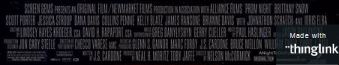
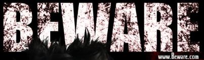
Throughout my trailer I have consistently used the same type face as thesis predictable and easy for the audience to take notice of it. I have used a scratchy blood colored font symbolizing blood, danger, etc. which is a conventional color to use for a title in the slasher genre. At the end of my trailer i have also placed my billing block which is also conventional in some film trailers as it marks the stars, producers/ main people involved in making the film.
|
I have consistently followed the typical shape/ font type face used in slasher horror films. As most films use a scratchy/ blood dripping effect symbolizing the death in the film. Also throughout the trailer each tagline/ coming soon and the site is always done in the same font following the house style which helps structure the trailer. This effect has been consistently followed throughout my trailer, and therefore makes it successful and convincing.
|
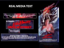
Through the research we have found that most slasher film trailers use the color red (For example A Nightmare on Elm Street), this convention is mostly used as it can symbolize blood, death, danger, violence, etc. This is also a contrasting color that stands out well again the other colors, especially the black/ darker areas which is also used a lot in horror films to create the tone/ emotion and is therefore more eye catching.
|
The Gradient effect convention is mostly used in psychological films (For example, The Conjuring 2 Trailer) however I have challenged the conventions in slasher films as I have used this effect on my film poster. This effect also connects to the subtext behind my film, as they are all being watched due to the judgement of younger by the society and therefore has that CCTV footage look. This effect looks very neat and professional and works well throughout my poster.
|
POSTER
|
Due to the research that our group had carried out for the typography and fonts used in horror posters, we decided to follow the main convention that a real media poster consists of in order to make it look more professional and convincing to the horror fans. We have done this by relating our horror poster to 2 real media texts "A Nightmare on Elm Street" and "Prom night" which also relate to the slasher genre.
|
|
|
|
|
OUR POSTER
|
REAL MEDIA TEXTS
|
|
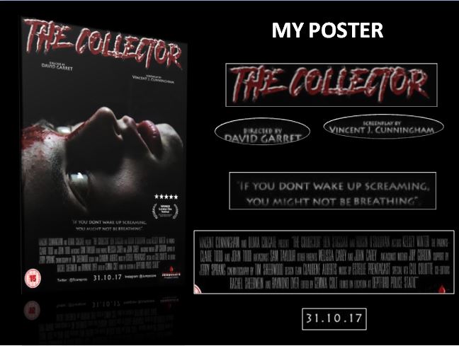
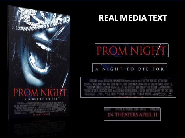
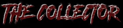
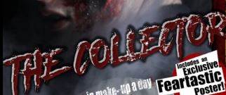
The title of the horror film is one of the most vital conventions used in a film poster as this is one of the key ways to advertise the film. The title is normally 1-3 words relating to the structure/ subtext to the film, also its presented so that its eye catching and easy to remember, this is done through the typography and font/ colours. We have followed the conventions for a typical horror magazine as we have used a scratchy, blood coloured font. Red has been used as it contrasts against other colours used and to connote blood/ dangers which signifies this as being a slasher film. We took inspiration from the 90's titles by using different contrasting tones from the grey and blood red/maroon.
|
|
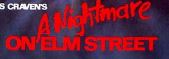
Using "A Nightmare on Elm Street", film title font as an influence to our title shows that we have followed the conventions from other real media texts that relate to the slasher genre. This is shown through the use of the colour red, however A Nightmare on Elm street has used a harsher red it still gets the same message across due to the shape of the letters. On the other hand this could be argued that we have challenged the conventions as "The Collector" uses a grey shadow which makes it look as if its 3D, we have chosen to do this as we feel it would stand out of the page drawing more attention to that area, so the audience would remember it.
|
|
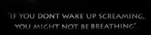
We have decided to follow the conventions used for a tagline as we have used capital san-serif letters throughout, using a gradient effect which related to the colour scheme of the rest of the poster. Although we have challenged the conventions slightly as the tagline is longer then our influences, we have used two short sentences that rhyme, which is also likely that this tagline will be memorable.
|
|
The tagline in horror films are also an important convention in a horror posters as this usually creates a dramatic effect on the audience. This usually located below the title or image. The Tagline used in "Prom Night" is short and normally easy to remember. This is also written in capitals in a simple serif white gradient font, this is because its against a black background which adds to the effect of mystery and enigma.
|

|
|
To create our billing block we used a billing block template which allowed us to add the names of the stars, producers and other important people that took part in producing the film. Doing this we have followed the convention as we also placed this at the bottom of the page bellow the title, image and tagline, by placing this there, this helped us structure the page to help us create a convincing, successful horror poster.
|
|
The Billing block is an important convention for every horror film poster as it allows the viewers to see who was involved in the production of the film. The similar typeface usually used for this is between, Univers Thin Ultra Condensed, Tall Skinny Condensed and Triple Condensed Gothic and Steel tong.
|
|
The release date is a vital convention which we have followed in our horror poster as this was positioned at the bottom middle of the page bellow all the other conventions. The text size used was the same as the tagline as well as the font, this allows the poster to look more professional and successful in the horror genre.
|

|
The release date is a vital convention used in the poster as this lets the audience know know when the film will be coming out. "A Nightmare on Elm Street" has influenced this convention as the have just numbers in a simple font which makes it simple and easy to remember.
|

|
|
MAGAZINE
|
|
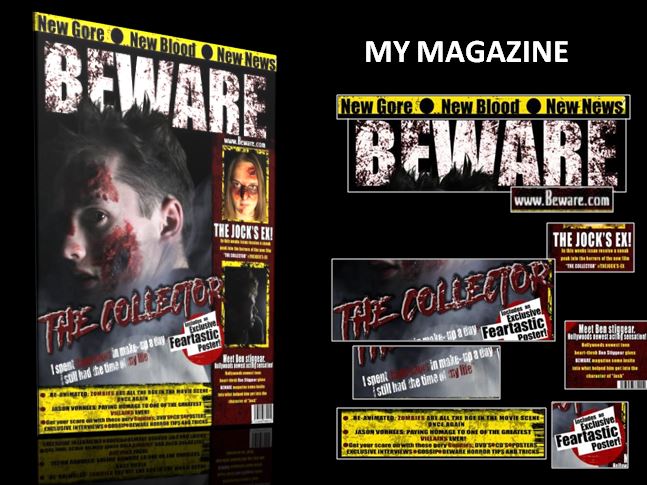
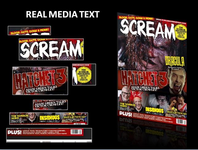
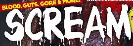
through the research that our group had carried out for the typography and fonts used in horror magazines, we decided to follow the main conventions that a real media poster consists of in order to make it look more professional and convincing to the horror fans. We have done this by relating our horror poster to different real media texts, the main one that influenced our work was the magazine by "Scream".
|
|
|
|
OUR MAGAZINE
|
REAL MEDIA TEXTS
|

|
I have followed the convention of using a strap line which is positioned at the very top of the magazine page. However i have used a black font which could be seen as challenging the convention as most streamlines use a color that contrasts against the border chosen, however the black against the yellow could connote caution and danger. I have used a bold simple ariel font to create this, and also stands out well against the page as its bold. I think this is very effective as it creates mystery which could be answered in the magazine.
|
|
In the inspirations I have looked at they tend to follow the conventions of all using straplines that are located above the master-head. This is normally done in a bright colour that is in house style with the rest of the magazine therefore using similar font type. This normally also used a bored around in in a colour that makes the type stand out, this is to draw attention to the smaller, yet useful parts of the magazine.
|
|
This follows the conventions for a Masthead as the font type is white and bold with a scratchy red texture which adds to the effect of it being a horror magazine. This is positioned in the top middle of the bag, and is the largest text on the magazine page. The while color contrasts from the rest of the magazine as while has not been used often therefore is more memorable, this also makes the magazine looks more professional and successful.
|
|
The Masthead is usually the largest text on the page, normally done in capitals, this is to advertise the magazine company as this can be seen as there logo and is therefore remembered the first time the viewer looks at it. From the real media text they have used a dripped white font which stands out from the rest of the magazine as its a lot darker.
|
|
|
The main cover-line is an important conventions that commonly being used in real media products. This normally about what is featured in the magazine. This tends to be the same font used for the title that on the film poster as this shows a link in products, this follows the conventions of a cover line as it is big and bold which allows it to grab the views attention. Also this is been done in capitals so that the audience eyes are guided to this, this is also a way to advertise the new film about to be released.
|
|
This shows the main cover-line which is displayed in the middle or bottom of the magazine underneath the main images, slightly rotated at a angle which is set there to attract the audience and grab their attention. the cover line allows the reader to know what feature is in the magazine. This is usually done in a big bold font which a smaller cover line just below as a teaser to what the inside contents is about. This is also normally done in similar fonts to the cover line.
|
|
I have used/ followed this convention in my magazine to advertise/ sell the magazine because what the contents hold. I have done this using a black, bold, box type font against a while border/ box which is over a red circle.
|
|
This convention that is commonly used in magazine either advertising something within the magazine or advertises the price/ issue number. If advertising something in the magazine the type face is slightly bigger and bolder and used a catch phrase to get the audience interested. This can be as a good selling tool to boost sales on the magazine.
|

|
|
I have followed this convention by having this at the bottom of my magazine on a textured yellow border with the same font used throughout the rest of the page which follows the house style of the rest of my magazine.
|
|
This convention is used normally at the bottom of the magazine following the house style of colors. This is more information about the contents of the magazine and is usually done in a small font being advertised with the word "plus" in a bigger font. This draws the audience eyes to the bottom of the page where they might be ingested to find out what else is in the magazine that might interest them.
|
Props Used
MY TRAILER
|
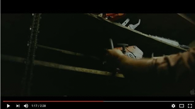
Movie genres typically follow certain "conventions" that have developed over the historical evolution of that genre. The "convention" to emphasize knives in slasher movies to portray the antagonists power over all its victims. However we have slightly challenge the convention of typically using a knife in a slasher film and have used an axe instead. We have done this because we feel that over time the audience has become desensitized against weapons such as knifes, so therefore we used a axe as this is a bigger/ more powerful weapon that creates more suspense. We have not given away the typical identity of the weapon as we have used shadow effects with quick cuts to black to create enigma, this has also been done to hide the identity of the antagonist portraying him to seem even more powerful with no weaknesses.
|
|
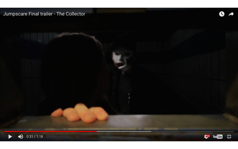
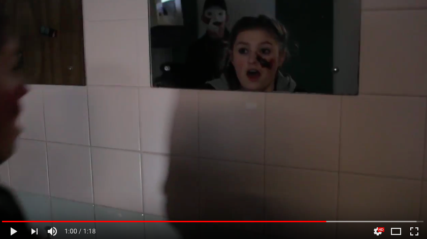
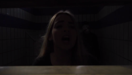
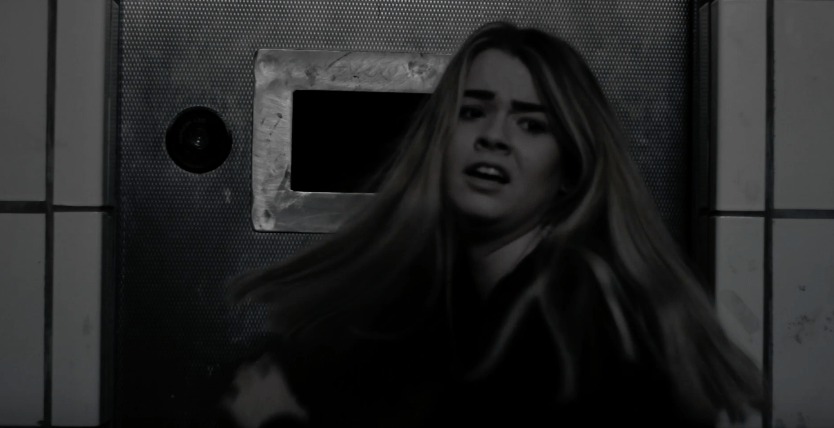
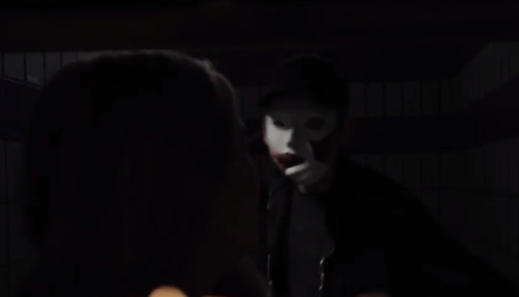
Using a mask in a horror film is very conventional as this hides the identity of the antagonist which creates a sense of mystery to what the antagonists history may have been like which also would reveal why he's in a mental state killing his victims. The identity is hidden in the trailer so that this catches the eye of the audience as the mask is broken and if covering the antagonists face slightly, but where its not there are scars which leads to the subtext behind the film and that's revealed in the full film. I have followed this convention as the identity of the antagonist has to be hidden in the trailer as if its not It would give to much away that the audience would not want to see the film as it would be predictable and not as jumpy as they no what the villain looks like.
|
|
|
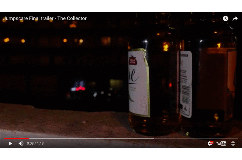
Alcohol was used as a texture shot as well as a prop throughout our trailer, this adds to the subtext behind the film of why the victims were being targeted in the first place. They were being targeted because they were underage drinking/ smoking, doing illegal drugs and breaking and entering. This could also be seen as a way a teen punishment for the way society judges the younger generation. The younger generation are stereotypically seen as the bad influences among the society and therefore have to be punished for there crimes. |
REAL MEDIA TEXTS
|
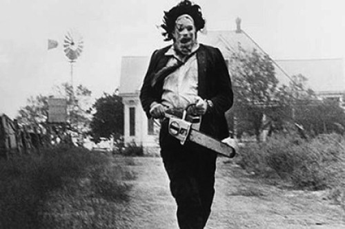
Texas Chainsaw Massacre has influenced my horror trailer as they have used a chainsaw over a knife which also breaks the typical weapon used in a slasher. Over time the audience have become desensitized to weapons such as a knife as its small and predictable, however in this film the use a chainsaw with is a lot more extreme for a weapon which makes the audience interested to see the film as they could gain visceral pleasure from this. This has influenced our trailer as we decided to use an axe instead of a knife to give the effect that the antagonist is more powerful, due to the increase of the size of the weapon.
|
|
The antagonist in Texas chainsaw massacre is also seen putting on a mask in a scene of the trailer, this influenced our would as its conventional to hide the identity of the antagonist and not to give to much away to create enigma and suspense. This is conventional and used in most slasher trailers such as "A Nightmare on Elm Street", "Scream",etc.. this is normally done to add subtext to the film as the antagonist has gone through something in there past and therefore has made them mental to go after people and killing them. Using this convention in my trailer makes my product more convincing in the slasher genre making it successful. |
|
Narrative, Structure/ Themes
Todorov Theory
 |
|
Strauss- Binary opposition

|
Some of the Binary oppositions that we have used throughout our trailer are, Antagonist Vs Protagonist and Male Vs Female between these two characters. This is been done to show the power someone can have and although the protagonist looks scared, they defeat the antagonist towards the end. This convention hs been followed as we have also used the fact that the protagonist is a female and the antagonist is Male. This is predictable and used in most slasher films as the antagonist is evil/ portrayed as strong and powerful due to his masculinity and the final girl is portrayed as weak as shown that she has been slashed along the face and also through her facial expressions.
|
|
"A Nightmare on Elm Street" has influenced us to follow the convention of having binary oppositions of the protagonist Vs antagonist and Male Vs Female as our main characters throughout as they have used this towards the end where the two go up against each other/ where they meet, this is the climx of the trailer as the producers don't want to give to much away, as of course the final girl wins. This scene shows the antagonist torturing/ being in power over the two which is eye catching to the audience as they would want to know whats going to happen. The camera angles used also shows that the antagonist has more power which portrays him being more masculine/ Stronger. This convention has been followed in my work and therefore makes our product more convincing/ successful for using conventions for horror trailers.
|
|
Comparing the media texts. Including, colours and theme
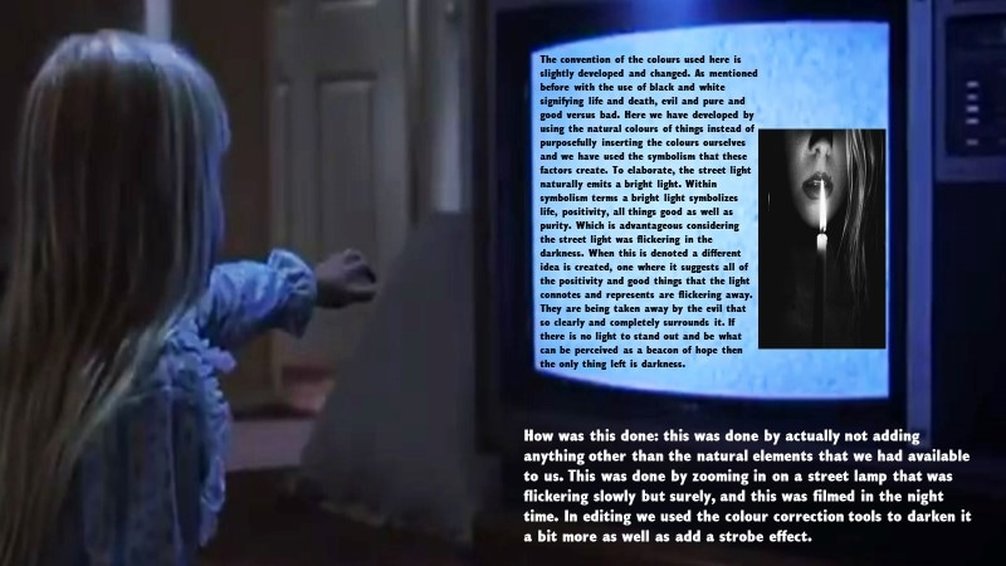
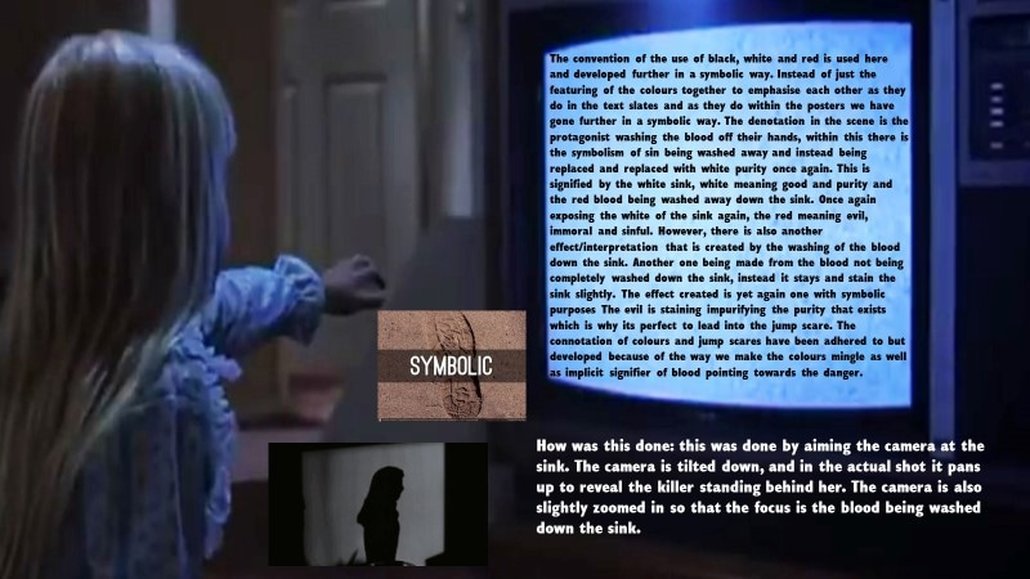
Firstly, colour helps to convey certain themes and atmospheres, each individually have certain codes and connotations. Thus, when they are used together a more obvious and largely understood effect is created. They are a part of semiotics, they assist in denoting signs, it is apart of media language. Particularly within horror movies the colours used signify certain aspects, for example within the trailer the colour yellow is used for the warning sign. The colour yellow has connotations of hope, optimism, clarity and positivity which is why it is so effective when the atmosphere it is created around is one with such an intense, crazed, rushed and overall frightening atmosphere (this could be an example of us attempting to develop/challenge certain conventions). In addition to this other colours that have certain conventions that work within our media products is the colours red, red connotes ideas of blood and fire, passion and lust. Again the connotations behind the colour is the reason they work so well within the media products. Especially because the products are a part of the slasher movie genre, a genre that continuously denotes teens acting promiscuously or upon impulse and spur of the moment impulsive feeling. All aspects that relate to passion and lust. However, the more important aspect of the colour red would be the connotation of it being linked to evil, another aspect that is often denoted within horror movies. This links into the next statement of certain colours needing to appear in media products because of the expectations that the audience have, and the expectations that the audience have been conditioned to have. For example, another colour that needs to and is repetitively denoted within horror movies is the colour black. The colour is connoted with ideas of death, evil (once again) and mystery. All of these connotations are greatly present within the horror genre, thus they assisted with us when trying to convey and adhere to certain typical conventions.
 |
 |
 |
 |
Real media texts, how they inspired our products and the effect that was created.
|
|
|
|
|
|
|
|
Dramatic camera angles/techniques.
 |
 |
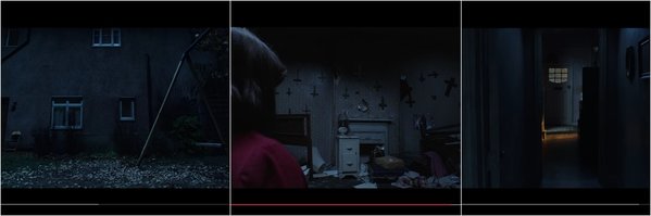
Show the highlights of the film convention.
Movies that show too much. |
Movies that show the right amount/do not give away too much. |
|
|
|
|
|
|
Our movie
All settings seem to be isolated.
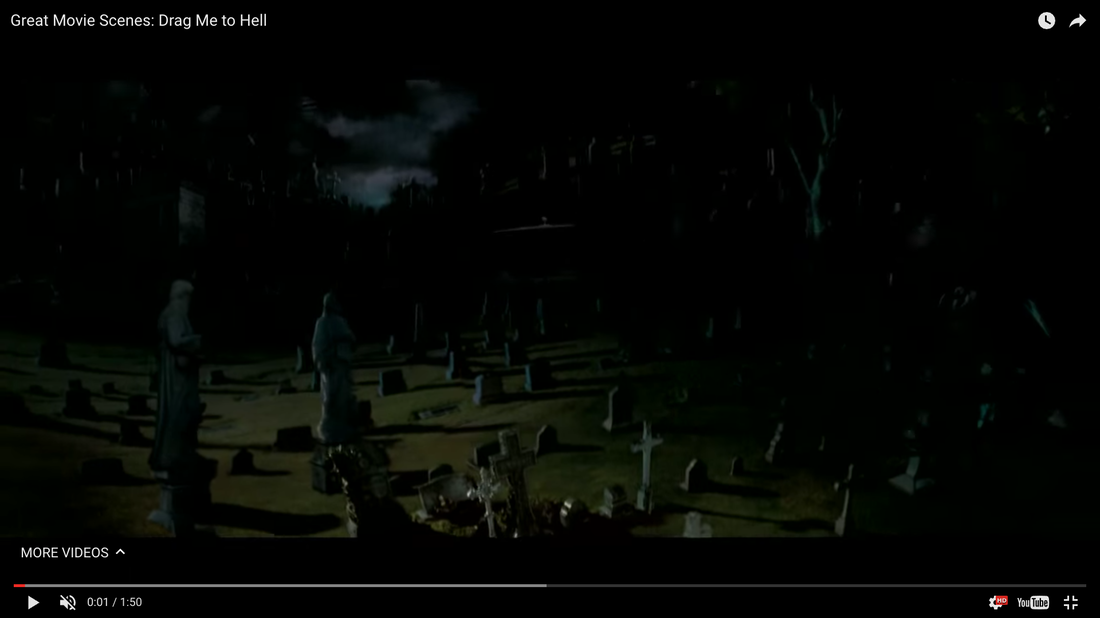
The Conjuring 2 .
The Boy.
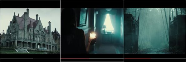
Nightmare on elm street.
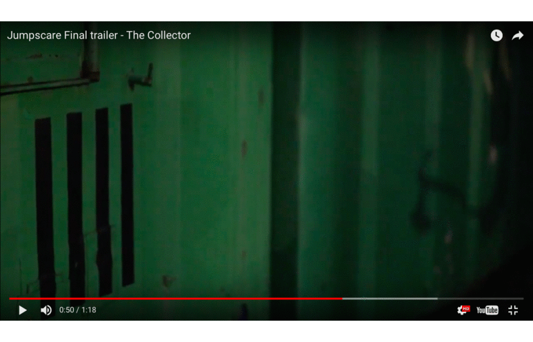
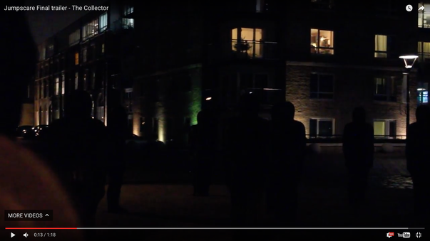
The Collector - (our own trailer).
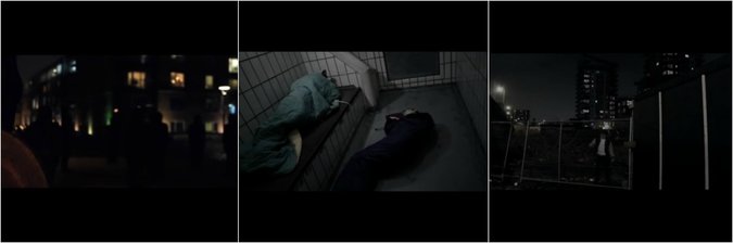
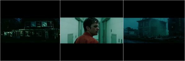
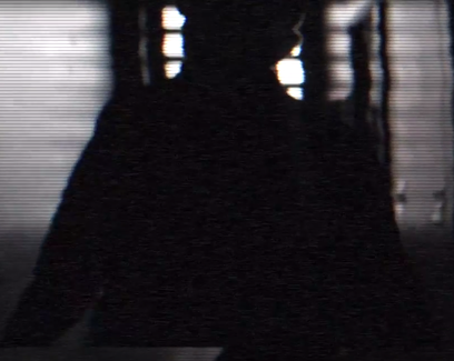
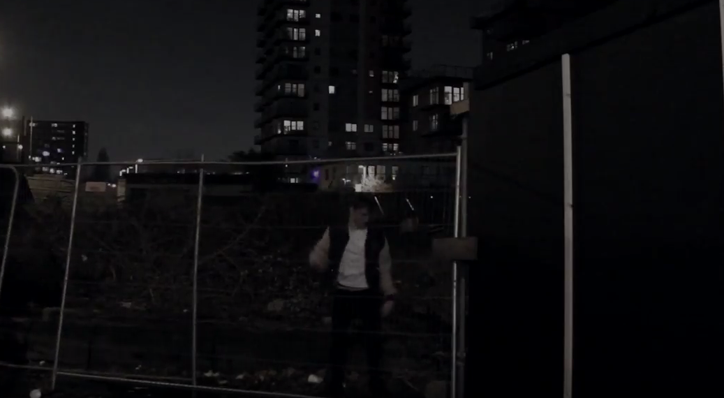
After researching into the settings of a slasher horror, i identified that a common convention to include in horror teaser trailers were the isolated settings they were filmed in. I therefore concluded the best settings to use if i wanted to follow this convention was low key lighting and isolated places. I took this inspiration from Nightmare On Elm Street, The Boy and The Conjuring 2, i chose these trailers because they were in the same genre as mine and they also had several similarities in regard to where and how they were filmed. To create this convention in our own trailer i wanted to make sure i maintained the mood that was projected in the trailers that i was influenced by. For example in Conjuring 2 - the first shot, there was a panning up shot of the house where the film was set. The lighting and angle used assisted by photoshop created an enimgatised mood that i wanted to set for my own trailer. A way i continued this into my trailer was by always using low key lighting in every scene and by colour grading everything in photoshop, whilst adjusting the lighting and contrast in the shots too. i focused on doing this especially in the cell block scenes where my characters were sleeping. This was because the lighting seemed so bright through the camera lens that i knew it wouldnt have set the right tone for my teaser trailer. This has contributed to my work in a positive manner as it looks a lot more effective then it did before, it has created the mood that i was after and mirrors exactly the trailers that i was influenced by.
|
|
|
Non - diegetic Sound.
Non - diegetic sound is sound that comes outside of the story source, for example, something that is not visible on the screen.This is a common convention that all trailers use, this creates atmosphere and tension into the trailer through the post-production editing stage. We used this convention because it was guranteed to make our work more conventional and effective. Through research and planning i discovered the types of non - diegetic sound that suited horrors best. I used this throughout my own work when i was creating my sound design because i knew sounds like deep drones and fast paces were the most effective. For example for inspiration, i tried to create a similar sound design to the boy's teaser trailer. For example as soon as there was a sense of disturbance and the disequilibrium started, there was a deep drone that is a common identifier of a horror. This communicates to the audience who they can associate the antagonist to and who are the possible victims. I took this into account when doing my own trailer, for example as soon as the disequilbrium started, i used a powerful and dark tone that would similarly indicate to the audience the seperation of the good and the bad in my teaser trailer. This effected the trailer in a positive way because it created the aspired tone and made it more effective to watch.
|
|
|
Diegetic Sound.
Diegetic sound is sound that the characters can hear as well as the audience, for example a car beeping its horn. This is also an common convention that all trailers use because it is natural in the scene. This is used to create a sense of reality throughout the trailer even with the budget restrictions we had for things like props. Through research and planning i discovered the types of diegetic sound that i could introduce to the dialouge of my teaser trailer and suited a horror trailer the most. I made sure i used things like screams and speech dialouge to create a reality of a teaser trailer. For example, i used the nightmare on elm streets teaser trailer for inspiration. The screams of the protagonists created an atmosphere that was more dramatic and realistic, it makes the audience feel on the edge of their seats and therefore i knew i wanted my trailer to be like that. I done this by continuing it into my own trailer, for example the dumb blonde got stuck in the cell with the antagonist, her screaming and calling for help created an icy atmosphere that i wanted my trailer to feel like.
Montage.
The montage section of the teaser trailer is normally in the middle of the trailer, its where the speed picks up and the lengths of the shots are shorter, this creates a rapid and intense response from the audience as they feel more on edge as they carry on watching. This is conventional in a horror teaser trailer, the main reason why they exist is to make the audience want to watch the film when it comes out. A montage sequence really brings them into the storyline of the trailer and intrigue them about what is going to happen. Through research and planning I concluded that we should include a montage into our own trailer because it was conventional for horrors and very effective in a positive way. We took inspiration from films like nightmare on elm street, the boy and the conjuring 2. For example they all have chase scenes to build up the tension without showing the antagonists face, these are effective because they build up tension in a horror and make the audience feel on edge throughout the whole of the montage. I decided if I wanted my trailer to be effective like these real media text then I should include a montage also. I also identified that the non-diegetic sound tended to quicken up and get louder as the montage started and went on. For inspiration I took The Boy trailer and focused on the montage sound in that, I identified that the sound got louder and quicker with a mixture of booms in the intense parts. I decided I wanted to include this and have a similar pattern in my own trailer because I knew that was effective and worked well.
Stock Characters, Costume and Make-up
For our teaser trailer we decided to use iconic stock characters that are featured in most slashers. We done this so our teaser trailer would be easily recognizable as a "slasher" horror for our audience. These stock characters are "The Final Girl, The Jock, The Dumb Blonde and The Masked Killer".
The Final Girl
Real Media Text - Ginny (Friday The 13th)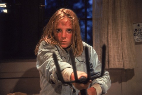
|
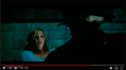
One of the protagonists featuring in our trailer was "Charlie", the final girl. We decided to stick to some of the typical conventions for this stock character as we wanted our trailer to be recognized as a slasher. We gave this character a unisex name, charlie and dressed her in jeans, converse, a hoodie and jacket. These clothes are in no way shape or form revealing, reinforcing the convention of the final girl being pure. In this trailer we challenged a convention with the final girl and allowed her to drink. As the sub-text behind this trailer is Alcoholism we wanted the final girl to be fully involved as it was a major part of the story line. The fact that this is her first time trying alcohol, she is being targeted immensely by the masked killer as a sign of punishment, conceptually telling kids/teenagers not to drink. I have communicated this visually to viewers through FX make-up of a knife wound on the victims face. This is conventional as every final girl in slashers typically have a wound or something visually showing how the killer has targeted them. However despite the final girl drinking alcohol, we also kept the convention of the final girl being a virgin and decided not to include her in any sexual acts. The inspiration for this stock character was "Ginny" from the horror movie Friday The 13th as we thought she played the role of the final girl effectively by becoming masculinzed by the phallic object she holds in her hand. In our trailer we didn't include shots of Charlie holding a phallic object which could infact challenge concepts along with the conventions of the final girl as she is the only victim that fights the killer back. I feel this trailer challenges some conventions about the final girl, as we didn't include any shots of her surviving the killers hunt however a teaser trailer is not supposed to inform us what happens, but teases and persuades viewers to watch the actual movie. I think this character sticks to the main conventions which makes her character conventional and be easily classed as this stock character.
|
The Dumb Blonde
Real Media Text - Dumb Blonde (Scream)
|
The second protagonist that featured in my trailer was "Emma" who was "The Dumb Blonde". We used a blonde female model which worked efficiently for this role. In my trailer she comes across as scared very easily. This was depicted through her loud, dramatic, helpless screams throughout the teaser trailer. The real media text we looked at for inspiration for this stock character was the dumb blonde that was in "Scream". We felt that she portrayed the role effectively through wearing revealing clothes, drinking alcohol, along with her loud screams and cry's for help. We challenged some conventions for the Dumb Blonde as we do not stick to the revealing costume. In the trailer she wears a long sleeve t-shirt with a black skirt and short black heels. These black skirt and heels may conceptually mirror the rebellious attitude the dumb blonde has as connotations for black is death, negativity. This long sleeve t-shirt does not reveal her arms, however this contrasts with the skirt and heels. In the trailer we do not have close ups of her costume which may trigger concepts for audiences as to what stock character she actually is. We wanted to significantly rely on the way she acts in the trailer rather than showing what she is wearing for the audience to identify what stock character she is. This conveys a sense of intellectual pleasure in our trailer, engaging viewers to the fullest. I did not include any FX make up for the dumb blonde as in my trailer I have cross faded a scream into a text clip, leaving a sense of enigma/uncertainty of what happened to her (intellectual pleasure). However we did include glamorous, stereotypical girl make up which was used to help depict her as a girly girl. This includes everyday make up such as mascara, nude lipstick, foundation, bronze, blush, contour etc.
|
The Masked Killer
Real Media Texts - Masked Killer (Chainsaw Massacre)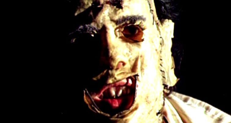
|
The antagonist in our teaser trailer is the stereotypical iconic masked killer featuring in every slasher horror movie. We decided to stick with the killers conventional rules as this character is one of the most important characters in the trailer. This character is the reason why our trailer is a slasher due to his unknown identity, weapon etc. We took inspiration from the masked killer from the "Chainsaw Massacre". We liked how areas of the killers skin was revealed under the mask, so we decided to cut chunks out of the mask revealing part of the killers skin. This mask is effective as it masks the killers idenity create a sense of enigma/mystery and maybe emtional plasure for viewers. We used FX make-up on the killers skin underneath the mask to create a burn, along with a zipped mouth and blind eye (white contact lense). This was effective as it may hint to viewers the past traumas the killer has experienced which may be the reason why he is hunting "innocent" people classed as victims. We also thought this looked scary which is effective as in horrors we want our antagonist to come across as violating and intrusive. His weapon is an axe, which is classed as a phallic object, giving him authority when penetrating the victims skin. In the trailer shots of the killer attacking both of the female protagonists are included, which may convey a sense of visceral and emotional pleasure for viewers. His clothing is conventional for a killer. He wears a grey sweat shirt, black jeans, farmers wellies and a dark blue jacket. The wellies are conventional as they represent the country-side, isolated locations where most slashers are filmed. I feel like this stock character is easily recognizable and will help my audience depict what sub-genre my teaser trailer is.
|
The Jock
Real Media Text - The Jock (Scream)
|
The final protagonist that featured in my slasher teaser trailer was Josh, The Jock. This was another iconic character that features in slasher horrors, helping my audience easily identity what sub-genre my horror is. I followed the conventional rules for this character in many ways. For example, we dressed the male actor in a white t-shirt, black jeans, sneakers and a baseball jacket. The baseball jacket was significant for this role as it is a jock's pride and joy and is typically what viewers look for when depicting this character. This jacket signifies the alpha male, along with his impressive sports talent. In my trailer I have included this character in two shots. One, drinking alcohol, reinforcing the rebellious behavior most jocks have due to their ego's from getting all of the "hot" chicks. This is reinforced with the second shot of him climbing over a fence, breaking into the abandoned warehouse. I have included FX make-up on the jock, however didn't feature him in the trailer. This character is featured on both the magazine front cover and film poster. I have gone against the typical female victims that are usually featured on posters and have included the male jock instead. This is effective as we may get a different response from viewers, along with a varied demographic for the gender ratio. This could happen as female viewers could be attracted by this character, making them want to see the film. Overall I feel as if I have kept this characters main iconic conventions so my audience can easily recognize what character he is and what sub-genre my teaser trailer is, however have changed aspects such as including him on the poster and magazine to make this movie stand out from previous slashers.
|
Cut To Blacks
A cut to black is a film transition which is commonly used in horror movies to create a sense of tension, suspense and keeps the viewers on the edge of their seats. This takes part in the post production editing, where film makers use software's such as "Final Cut Pro" to help accentuate, perfect their product. In this case I used "Final Cut Pro X" and have added cut to blacks to where I feel conjuring tension would be necessary. We have taken inspiration from real media texts which were "Chainsaw Massacre 2013, Halloween and Friday The 13th". These real media texts use these cut to black similarly to build suspense. Building this climax is significant in slashers as it conveys an sense of visceral/emotional pleasure to viewers, keeping them on edge throughout. From looking at real media texts I recognized that cut to blacks typically occur 3/4 into the trailer as well as at the end of the trailer. This mirrors sexual symbolism that are featured in movies and horror trailers through the use of props as phallic objects (Knife penetrating the victims skin). It starts of slow, and gradually builds tension until it reaches the climax. In my trailer I have mirrored this sexual symbolism, sticking to the typical conventions for slasher teaser trailers. To be more conventional I have also matched these cut to blacks with the non-diagetic sound. This accentuates/emphasis' these cuts, helping to convey a sense of both visceral and emotional pleasure throughout my trailer. For example towards the end of the trailer we added repetitive boom sound effects which gradually increases in speed. I have mirrored this by decreasing the cut to blacks in length which help to build tension. By using this typical horror convention I am making my media product easily recognizable as a horror trailer which may help audiences depict our genre from other movie genres.
