Vincent Cunningham
This section of the Pre-Production stage consists of drafting for our horror poster and magazines. This includes drawings and edited Photoshop developments to show how we got from point A to point B.
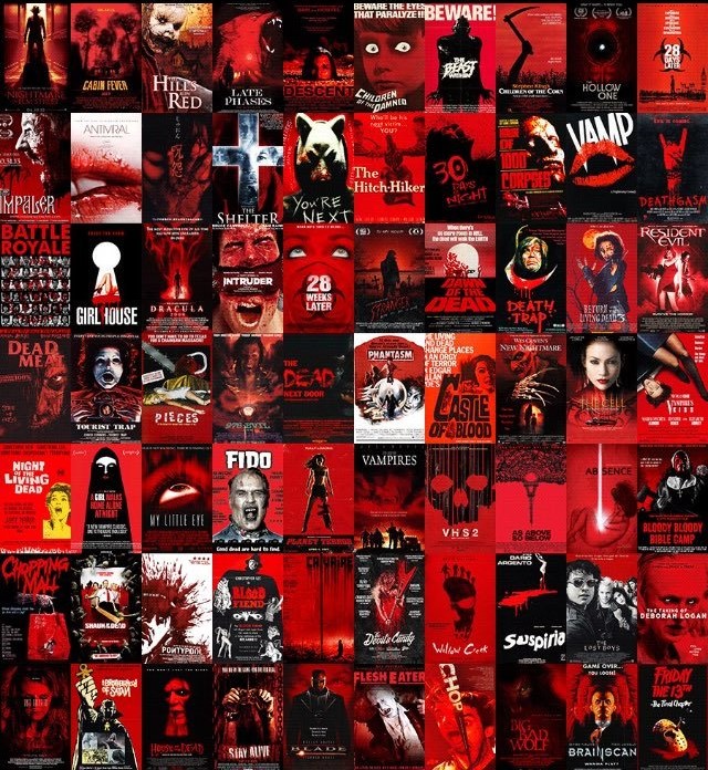
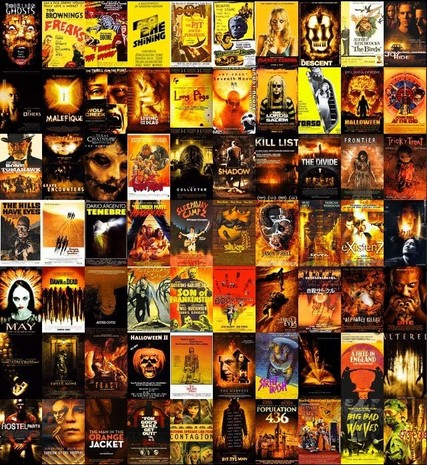
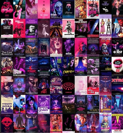
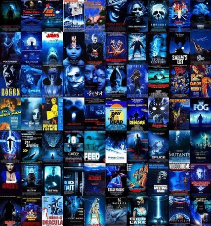
Poster Inspirations:
  |
  |
 |
As you can see underneath, horror posters use the same type of colours. We decided to take inspiration from the "red" coloured horror posters as red connotes a range of negative representations such as aggression, rage, blood, danger etc.
|
|
|
Drafts - Hand Drawn:

In this poster draft we decided to include a hand covering the victims mouth as this is an iconic pose of being violated, kidnapped and abused. Our concept was for wounds to be on the victim showing viewers what the antagonist is capable of. This main image takes up most the the poster which may strike viewers eyes. I have placed the title of the film on its side. This is effective as viewers have to be engaged in order to read the title. For example they would have to tilt their head, this will avoid viewers only looking at the poster for 1 second as they wont be able to read anything. I am going to texture this typeface, making it look worn out and rough. The colour of the title is going to be red connoting representations of blood, anger, rage and aggression. The negative space is going to be black representing death, negativity and darkness. The tag line is positioned at the top of the poster and is smaller than the title. I am visually communicated the hierarchy to the audience through scale, as the title is bigger, meaning it is more important. The tag line is white, contrasting with the black negative space creating binary oppositions. These may be life and death, victim and killer, protagonist and antagonist etc. I included "coming soon" underneath the title. This is going to be white, matching with the tag line at the top of the poster, creating an aesthetically pleasing look.

We decided to use a close up shot of the victim with a wound on her forehead. We purposely chose a female to reinforce the typical female stereotype we see in the horror genre. We took inspiration from scream for this shot as just like their poster, we are focusing on the facial features, mainly the eyes. This is also at a high angle shot, leaving the victim to look up at the camera, feeling intimidating and scared. We decided to place the tile at the top of the poster for this design, reinforcing typical poster layouts. Above the title we placed the tag line. Again the title is going to be textured and red and the tag line is going to be white. We are going to use side lighting int he digital draft which is why I have shaded the right eye darker than the left eye. This is to show shadow. I would also like to add a hand print on the poster as it is a typical conventional horror signer that is used many times in films today.
|

In this poster we wanted to capture fear so I decided to sketch a girl being dragged away holding onto a curtain. This is an iconic pose, enabling viewers to figure out that it is a horror movie straight away. This curtain will be black in the digital draft and will blend in with the negative space. This will be effective as black represents negativity and death. We have deiced to place the title at the bottom of the poster this time followed by the tag line and "coming soon". We think it looks more professional this way. The title and "coming soon are red, contrasting with the purity of white on the tagline. This will help catch the viewers eye visually. This colour scheme fits with the "slasher" sub-genre well, helping audiences to predict what time of horror movie it is.

The concept for this poster deign was to include the antagonist. We did this effectively without revealing him, instead we only revealed the knife he uses, his hand and part of his leg. In the poster he is outside looking into the abandoned location where his 3 victims lie asleep due to alcoholism. I have featured the title of the movie on the wall of the building the antagonist is looking into. This title will be white, the tagline underneath will also be white and "coming soon" will be grey. I have left hints in this design about the subtext due to the weapon shown. This is a knife which can also be perceived as a phallic object. This phallic object is used in the film to kill the victims, or in other words punish them. The subtext underneath this trailer is punishment for rebellious teenagers. In the digital draft I am going to layer a red texture over the image, representing blood splatter which may visually please young audiences this is targeted for such as teenagers.
|
Drafts - Digital

We decided to take a twist on the first poster design of the hand covering the mouth and used a piece of paper acting as tape. This looked effective along with eye contact from the victim as it engages viewers and makes the victim look vulnerable and scared. I feel as the FX make up helped intensify this look, which may leave visceral pleasure for audiences through the use of fake blood and bruising. The title has been textured and colour red. This contrasts with the back negative space, representing rage, anger, blood and black, darkness and death. The white contrasts with the black, striking viewer's eyes. We thought that the typeface was not correct as it was to formal and doesn't convey a sense of gore or violence. To improve we are going to use more edgy fonts with sharper edges to reenact blades from the knifes.

For this digital draft we deiced not to stick to the drawn design. This is because at the time we couldn't find a window big enough to see 3 people sleeping. Instead we just took a close up of the antagonist's knife with fake blood dripping down it. We positioned the title on the side of the poster and added the tag line at the bottom. To help accentuate fear and an eerie vibe I added texture to the negative space acting like blood and added a blood red tone to it. This helps intensify the gore factor, clearly showing viewers it is of the "slasher" sub-genre.

The digital draft came out effectively as we stuck to the original design. We kept the same font as the previous design, however positioned it at the bottom of the poster, followed by the tag line and "coming soon". I added a yellowish tone on the main image to represent connotations of caution and warning. The blood splatter on the photo is effective as it mirrors the blood of the victims the killer has killed. The texture on the text works nicely with this creating an aesthetically pleasing factor. For this image we deiced to use side lighting mirroring binary oppositions of life and death.
|

As a group we chose to also do the original design to see what it would look like. This hand covering the mouth helps convey a sense of fear to the audience. We positioned the title on the side of the poster. I created my own type face to create sharp, hooked edges to mirror the blades of the knifes that will be featured in the trailer. This is effective as it contrasts to the tag line, making the title special as it is the only word with the special font. This is another way of showing hierarchy through words in our poster. To add a rough, weathered look to the poster I added a texture over the top. This helps accentuate violence, fear and manicness, along with the red top the victim is wearing representing blood and danger.

We decided to stick to the original drawn draft with the inspiration of Scream. For this we used low key lighting to help convey a eerie tone and setting. The close up shot was used to give viewers a highly detailed view of the FX make up wound featured on the victim. In this case it is a bullet wound. Her direct address through looking at the camera helps engage viewers and catch their eye. I decided to add a condensation effect on the poster to mirror the freezing cold temperature in the abandoned location. I have textured this "condensation" and added a hand print to reinforce typical "slasher" imagery. I also created another font and positioned the title at the top of the poster to reinforce a conventional layout. At the top of the poster is the tagline in white which contrasts nicely with the negative space underneath the "condensation".
|
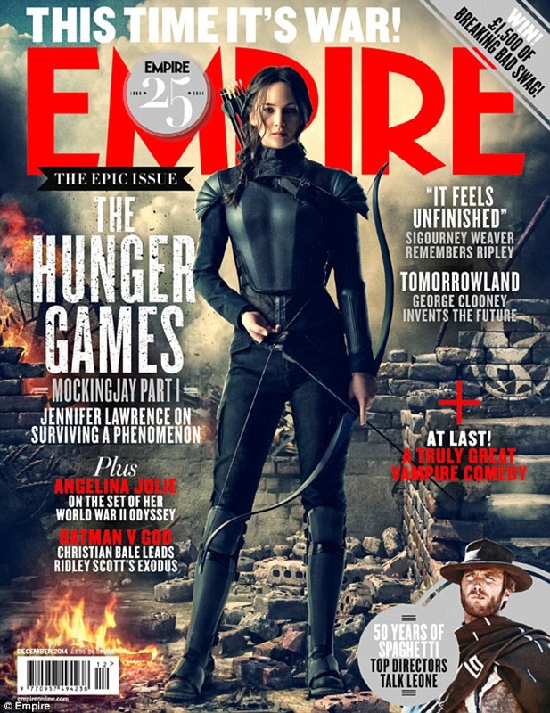
Magazine Inspirations:
This Magazine front cover caught our eyes through the use of a close up. A close up is effective as it reveals the facial expression to at the audience which determines what you are feeling. Make up has been used to accentuate the models facial expression. Black make up has been used around the eyes, emphasising the brow bone along with his frown. I am going to use theatrical make up in my magazine front cover in a close up shot to reveal to the audience the wounds created by the antagonist. This will also accentuate the eyes as I am going to give the protagonist featuring on the front cover 2 black eyes. These will both represent the abuse from the antagonist and also the immense amount of sleep they have head whilst they are in the warehouse (teenagers fall asleep in wear house, nightmares come to life).
|
We liked this front cover due to the use of texture from the door. We feel this accentuates the rough, violence portrayed through slasher movies and would like to take inspiration for our own magazine front cover. The layout of the magazine front cover is efficient and very easy to read with the masthead at the top, main image in the center, sell line at the top etc. The big close up of the male is effective as the audience get to see a clear facial expression, which may trigger emotions for viewers such as fear. We are going to take inspiration from this magazine front cover and use close ups so that the audience can see the fx make up and also the fear through the victims facial expressions.
|
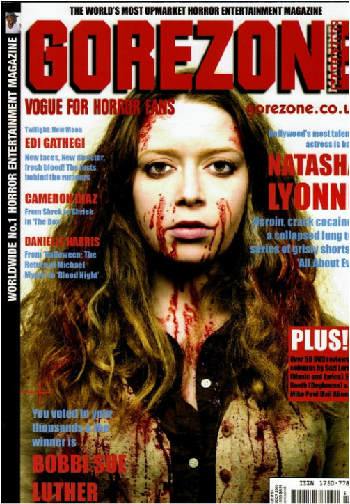
We liked the colour scheme which is , red, white, blue and black. These colours are evenly balanced throughout the magazine cover. We also liked the mid-shot of the female, along with fake blood on her face. This may show to the audience that she may be the "protagonist" (victim). The red that features on text and graphical elements represent blood, rage and danger, which works nicely with the sub-genre - slasher. The masthead is the most important as it is the name of the magazine, along with being the biggest word on the magazine cover. A drop shadow has been added to accentuate readability and attack viewers eyes. This mirrors the hierarchy as it is the most important word of the cover. The layout is nice, featuring a sell line at the top of the cover, following by a masthead and cover-lines. White connotes purity and has been used as negative space behind the model. This works with the victim as purity contrasts with the actions of the teenager, showing that she has broken purity to have been punished. The black shirt the model is wearing also contrasts with the white negative space as black represents darkness and death. As the model is wearing this shirt, it may reveal to audiences that darkness has taken over her - impure. We may take inspiration from this and use this layout in our own magazine. The layout is also effective as it still shows off the main image and doesn't cover too much.
|
Jump scare productions liked this magazine front cover through the long shot used for the model. This enables viewers to see the full costume of what the model is wearing. The masthead is red connoting representations of death, blood rage etc. We like the layout of the cover lines and how they mold around the model in the main image. The main image uses side lighting connoting binary oppositions. The graphical element and boost featuring in the mast head is clever as typically most people look at the masthead first when buying magazine. This means that they will instantly see the boost, persuading them to buy the magazine.
|
Drafts - Hand Drawn

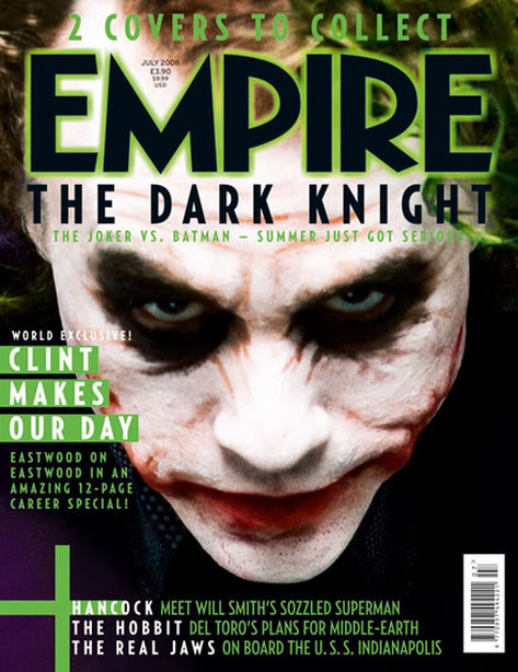
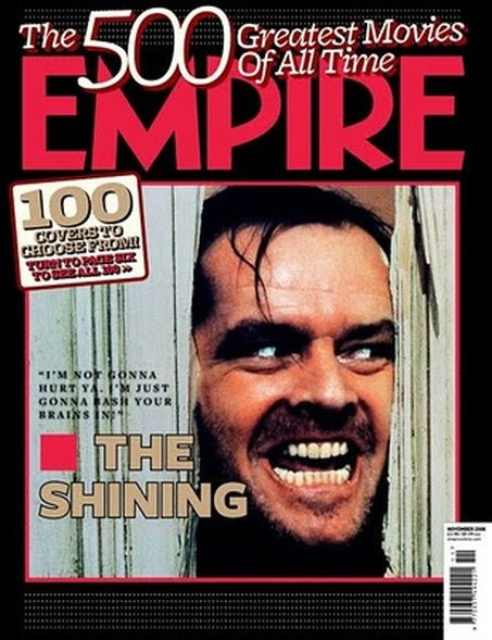
For this magazine design I decided to sketch the classic intimidated pose with both hands of victim raised and mouth open. The colour scheme of this magazine font cover will be yellow, red, white and black. Yellow connotes to caution and warning. Red represents blood, rage and danger, white represents purity and black represents death, darkness and negativity. We have chosen the classic layout by having the masthead (red) at the top, overlapping the hand, followed by a sell line (text-white) at the bottom of the page, images on the bottom left, graphical element (yellow) on the bottom right and article on right of the page. I am going to take inspiration from the Shining Empire magazine and use textured boxes behind the text. This will make the text pop and will immediately catch audiences eyes. I have used a big close up to capture the fx make-up and detail within the victims face, taking inspiration from the joker Empire magazine.

Here, we again took inspiration from the shining Empire magazine using a close up, however this only includes half of the victims face. We thought this was effective as it may trigger concepts about the other side of the victims face creating enigma and mystery for viewers. For this design the masthead is red, replicated blood, gore and pain. underneath the masthead features the graphical element containing the boost. We decided to place this at the top of the magazine front cover as people typically look at the masthead first, meaning now they will see the boost persuading them to buy the magazine even more. Above the graphical element is the cover line and below the graphical element is the mini article. I feel as if I have balanced these out, whilst trying not to cover up the victims face which is important as only half of it is showing. A wound is going to be features at the top of the victims forehead, connoting another form of pain which is both emotionally and physically.
|

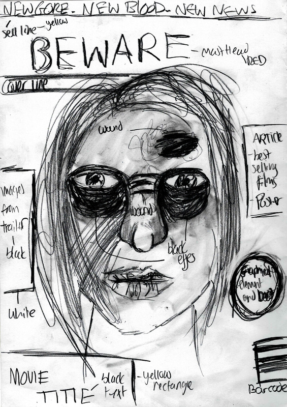
I decided to draw this mid-shot of a victim looking back to capture the paranoia, and fear the victims experience. The masthead at the top of this magazine is white, and the negative space/background of the magazine front cover will be red with textured blood splatters. This masthead is white connoting purity contrasting visually and conceptually with the background. Above the masthead is the triplet sell line. I decided for my sell line to be "New Gore", "New Blood", and "New News". I wanted to use the same word at the start as we though it was catchy and stick in peoples minds. The rectangle behind the sell line is yellow, connoting cautions and warning for audience members, daring to look at this magazine. Underneath the masthead featured the cover line, article and a boost/graphical element of the right side. This boost and graphical element will be white, aesthetically matching with the white masthead, creating a palette throughout the cover of red, yellow, white and black. I like this design as everything is layed-out effectively leaving space for the actual main image to be fully seen. This is good as i am equally balancing both information and visual objects.
For this design I wanted the victims to look beat up and wanted to take a mug shoot photo in the digital draft like they do in prison. This close up will give great detail to the make-up and effort put on the face, along with a direct address through the eye level camera shot. The masthead is red, mirroring the pain the victim is feeling conceptually and physically. I feel as if I may have squashed many elements on this front cover as some are draw unrealistically small such as the images from the trailer. I may reduct some elements so that not as much touches the victims face as it is only what the audience has got to work from.
|
Drafts - Digital

We decided to stick to the original drawn draft for this digital draft. This close up enables viewers to see the grotesque wounds on the victims head created by the killer. The mug-shot like image gives direct address through an eye-level shot. This engages viewers into the magazine and may also strike their eye as they are walking past in a shop. The negative space behind this victim is black conotating darkness and negativity and working nicely with other palette colours such as red, yellow and white.

This is an Inspiration from Gorezone magazine through mid-shot of female model - victim. The dark negative space makes her seem isolated, setting the eerie tone for viewers, along with the red texture lerking around the negative space. I have made the masthead white to contrast against the red negative space, making it clear for viewers to read the masthead. This will also help the masthead catch there eyes from far away. This is a typical pose featured in horror "looking behind". Both with the make up and pose audiences should be able to guess the main genre of the film, as well as through the colour palette.
|

Jump scare productions decided to stick to the draw as we though the enigma and mystery caused by not revealing the other side of her face was effective and may keep viewers on the edge of their seats. The masthead is red, connoting what may be on the other side of her face, more wounds? The graphical element is still featured at the top as we want people to see the boost as soon as they look at the masthead so it will persuade them to buy the magazine.

For the final digital draft we decided to stick to the draw draft. We tried recreating the sketch as much as we could and we can official say it was a success. The pose looks exactly like the image, conveying a sense of fear, empowerment etc. The only big thing featured at the top of the magazine front cover is the masthead as the sell line,cover line, graphical element, images and boosts are featured below. This is effective as it gives the masthead a chance to start triggering concepts when nothing else is there.
|
