The purpose of audience feedback is to hear back what the target audience has to say about our work/ final products that Jumpsacre productions has produced. Doing this we have had to advertise this on different social medias, this allows more people to come across it and view it, which gives a wide variety of opinions which includes both positives and negatives about these products.
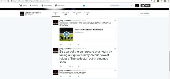
One of the main ways we gained audience feedback was through surveys as this is a quick method to gather information about our three media platforms that are completed. Gathering information about the positives and negatives about our products are very important as this audience research will show us if we have met the target market requirements. Our target audience was between 15 and 18 therefore we will be asking a range of these age groups using various social medias.
One of the main ways we gained audience feedback was through surveys as this is a quick method to gather information about our three media platforms that are completed. Gathering information about the positives and negatives about our products are very important as this audience research will show us if we have met the target market requirements. Our target audience was between 15 and 18 therefore we will be asking a range of these age groups using various social medias.
|
|
Facebook is an online social network service. This was founded in 2004 by Mark Zuckerberg. This social network allows anyone above the age of 13 years old to be a register user of the website. Facebook allows friends and family to communicate all online, different ways this could be done is by sharing photos, videos, links and texts. Facebook is very popular as mostly everyone knows about this or even use it. This is a great way to gain feedback from our audience as this social network can be accessed by anyone on any device.
|

|
You Tube was launched in May 2005, YouTube allows billions of people to discover, watch and share originally-created videos. YouTube provides a forum for people to connect, inform and inspire others across the globe and acts as a distribution platform for original content creators and advertisers large and small. |

|
Twitter is an online news and social networking service where users post and interact with messages, "tweets," restricted to 140 characters. Registered users can post tweets, but those who are unregistered can only read them. Users access Twitter through its website interface, SMS or a mobile device app. Twitter Inc. is based in San Francisco, California, United States, and has more than 25 offices around the world
|

|
Snapchat is an image messaging and multimedia mobile application created by Evan Spiegel, Bobby Murphy, and Reggie Brown, former students at Stanford University, and developed by Snap Inc., originally Snapchat Inc. |

|
More than 1 billion people in over 180 countries use WhatsApp1 to stay in touch with friends and family, anytime and anywhere. WhatsApp is free2 and offers simple, secure, reliable messaging and calling, available on phones all over the world. Due to its amount of users, this is a great way to get our products out therefore the target audience to respond commenting on positives and negatives.
|
|
|
Instagram is an online mobile photo-sharing site that allows its users to share pictures and videos either publicly or privately on the app, as well as through a variety of other social networking platforms, such as Facebook, Twitter, Tumblr, and Flickr. Originally, a distinctive feature was that it confined photos to a square shape, similar to Kodak Instamatic and Polaroid SX-70 images, in contrast to the 4:3 aspect ratio typically used by mobile device cameras. In August 2015, version 7.5 was released, allowing users to upload media captured in any aspect ratio. Users can also apply digital filters to their images.
|
Poster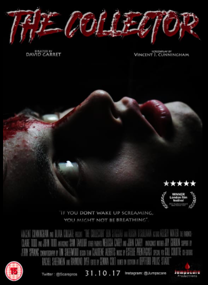
|
Magazine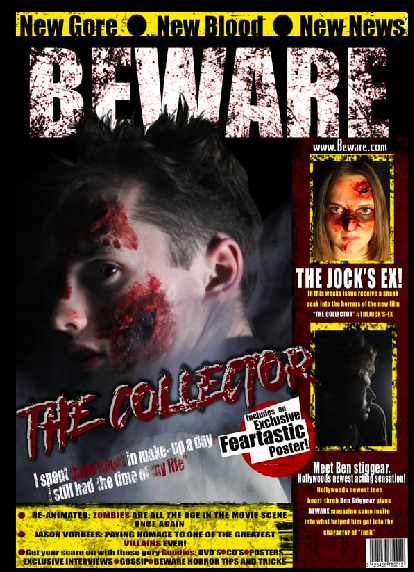
|
Trailer
Poster
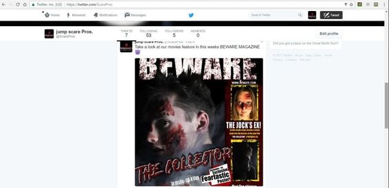
Film posters are a very popular use for films since the early 1900's. It is seen as a easy way to advertise new film releases as they can be put in a variety of places that will catch their audiences attention. For example bus stops or on social medias. We made sure we had similar conventions to the films we got inspiration from at the start, for example The Conjuring 2 or Nightmare on Elm Street. We made sure we kept continuity on the typography throughout or media platforms. For example "The Collector" is in the same graphics as it is on the trailer. We also made sure we had the same character from our trailer and lighting that all media platforms use.
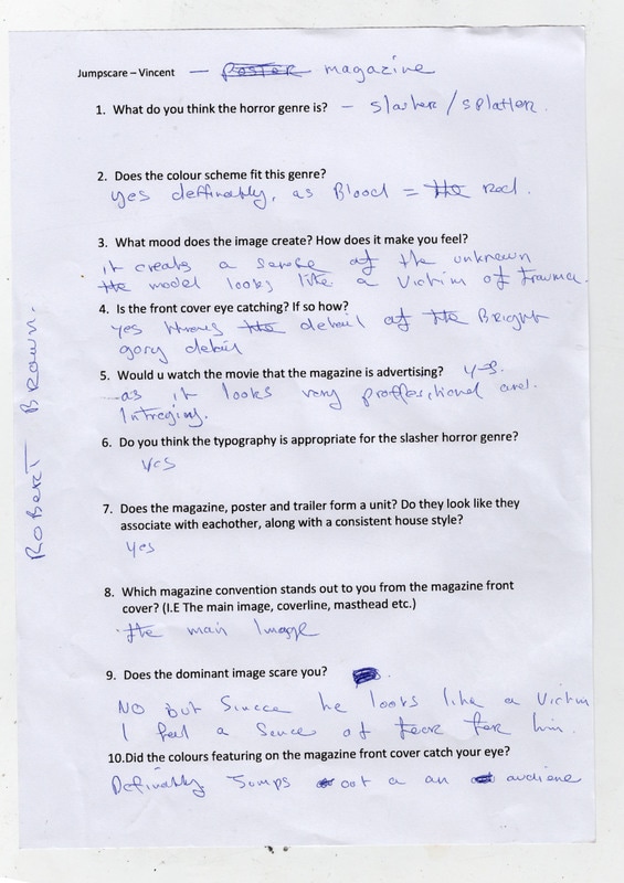
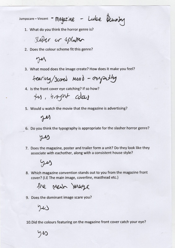
Poster questions for survey.Audiences written replies. |
Reviews on poster through facebook. |
|
|
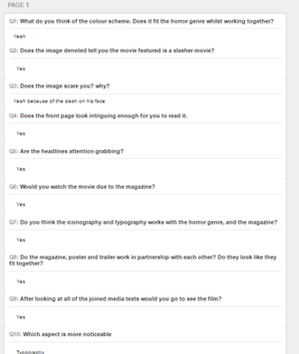
The free written questions is where we really got the feedback that helped us divide what was great about our poster and what was necessarily not so great. For example Question 3's responses allowed us to identify that a mixture of the audience believed that different features on the poster was more effective then others, this helped us conclude that all of the features had some sort of significance and importance to the poster that allowed people to be drawn to it.
Another free written question that allowed us to analyse our poster deeper was Question 9, asking if there was anything to improve on, all though there was a lot of people complimenting it and saying it was great the way it is we did have some constructive criticisms of the poster that would allow us to reflect on where maybe we could have improved. For example a few people mentioned making the smaller texts a bit larger as they will feel it would be clearer and therefore easier to read. In this case if we was to improve the poster then we could experiment with the typography sizing a little more.
One more criticism that allowed us to see how we could have improved was when people suggested making the character on the front of the poster stand out a lot more so its was more in your face and people knew how important they were to the film. Therefore to conclude if we was to improve something we could also improve that main image and make it a bit more brighter and effective. |
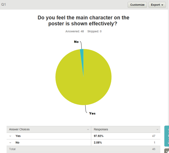
One of the multiple choice questions that we asked in our survey was if the main character on the poster was shown effectively. We asked this because we focused on this for quite some time and felt it was important that the main character related to our horror and was effective in doing so. As you can see from this graph analysis, 98% of the audience who answered our survey found that the protagonist on the cover of the poster was very effective for our genre of our film. Due to this we know that we done successfully well regarding how we portrayed the character in our poster.
|
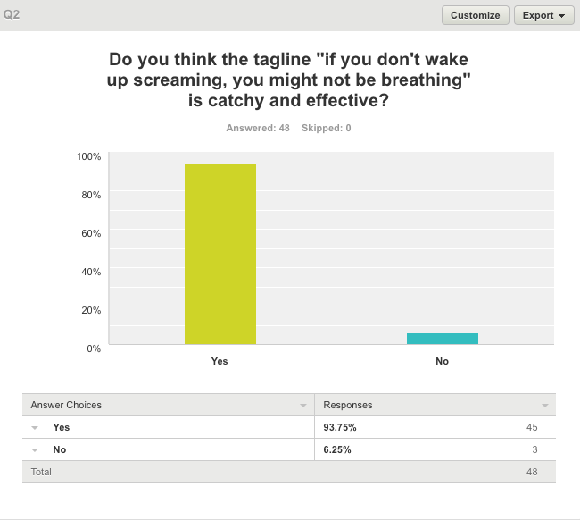
Another feature of our poster was creating a catchy tag line that stuck in the audiences heads when the saw it being advertised on the poster. As you can see from this chart, again the majority of the audience completing the survey agreed with the question. This is shown by the 94% of people agreeing with us. This indicated to us that the catchphrase we chose to put on all our media platforms was effective in a way we wanted it to be.
|
YouTube Responses - Vincent
Physical Surveys Completed - Vince |
|


|


|

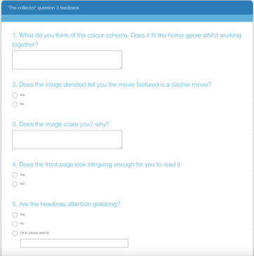
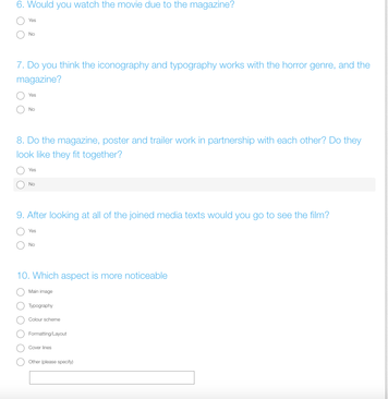
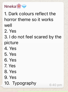
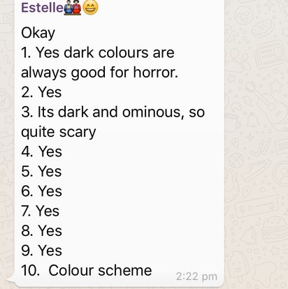
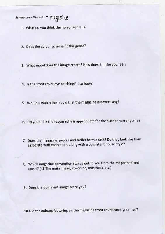
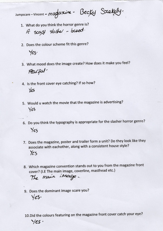
Magazine

Survey for magazine.
|
|
Feedback
|
|
|
|
YouTube responses
|
|
|
Youtube Responses
|
|
|
Physical Surveys Completed - Vince

|

|
Survey monkey results.
|
|
|
Graphical representation of the data.
|
|
|
|
|
|
|
|
|
|
Analysis.
|
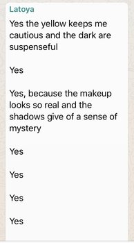
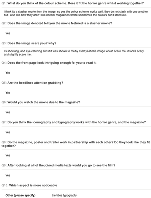
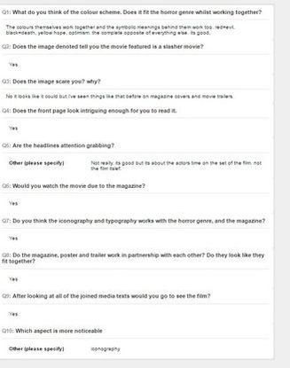
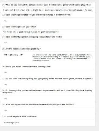
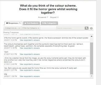
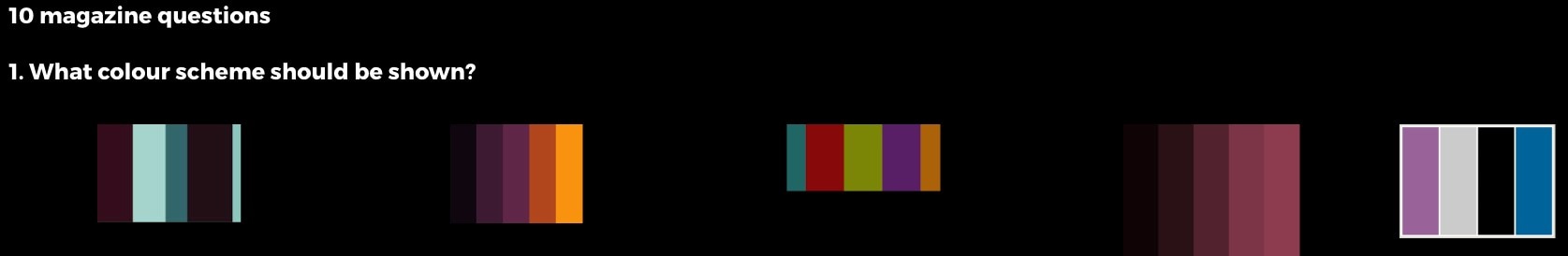
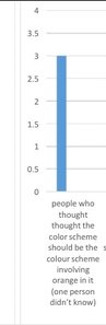
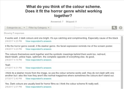
This is the questionnaire handed out to the candidates (candidates who also answered the current questionnaire) concerning the color scheme that should have been applied to the majority of the media products but more importantly the magazine. In this questionnaire most of the respondents (1 person did not know) gave strong opinions that the color scheme should have been the second one shown. Our understanding through this was the audience enjoy the typical denotations of dark colors in the horror movie genre, particularly because they help set the tone, atmosphere and overall mood for the media text.
However, I have learned through their responses that their likes have changed over time to enjoy the more vibrant colors. Most likely because they jump of the page. However, through this data analysis it can be said that the audience do not completely understand the symbolic codes denoted in media texts and how this increases the effectiveness of the media text. Although, the audiences like for the brighter colors mixed with the deeper more ominous colors was still clear and so we decided to develop on the conventions typically applied to media texts in terms of color and add colors that would be more eye catching and bold whilst also making sure that the colors chosen still worked with fitting into the horror genre. |
|
|
As shown, there is the inclusion of the color yellow. Through analysing past media texts in the slasher genre as well as looking at general past horror media texts we knew that the color yellow is one not usually used in the horror slasher sub-genre. However, the color yellow is bold and bright, which is what the audiences wanted and it also symbolises hope and happiness, which works in perfect juxtaposition with the rest of the media text since it all symbolises death and evil. It gives an almost false hope effect in terms of symbolic meanings whilst also giving out audience what they wanted.
The color white is one that can fit more into the death, despair and overall horror/evil theme. On the one hand it symbolizes purity and innocence, whilst it can also symbolize a near ghost like and supernatural entity. Which is something near to our antagonist as he stalks his victims in an almost haunting way. And also kills the protagonists in their dreams which is something supernatural. The rest of the colors are denotations of us adhering to the conventions that apply to horror media texts in terms of color schemes. They are dark and carry an element of mystery to them. |
|
|
|
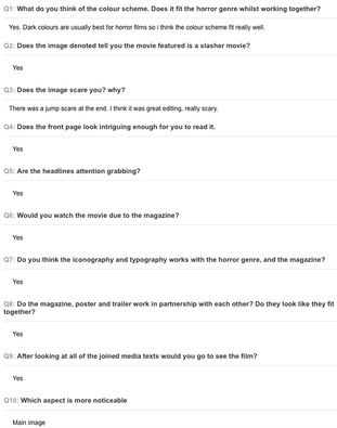
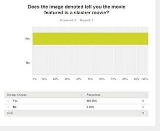
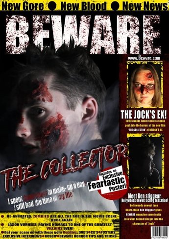
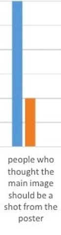
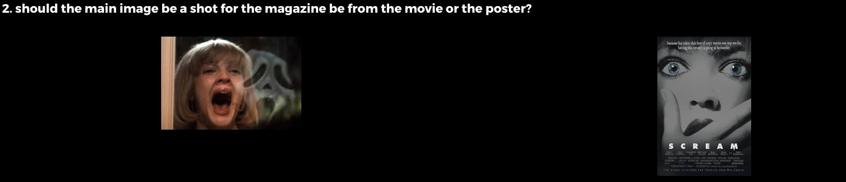
This is the question concerning color in the initial pre-production questionnaire. The respondents gave a mixed view when it came to where the image should have come from the poster or movie. Most agreed that it should, whilst one said that it should be from the movie.
However, the post-production audience feedback does show that whilst this is what the audience said they wanted, the denotation on the cover itself was actually liked and possibly preferred. Therefore, through the feedback we have learned that the audience do like the typical conventional denotation that is within horror magazines and do see it as fitting with the genre. A denotation of a character within the movie with an expression on their face, specifically addressing the audience (direct mode of address) rather than a picture from the poster or magazine. Overall from the audience feedback we’ve learned the best way to appeal to the audience in a horror magazine is by addressing the audience and denoting an intriguing picture.
However, the post-production audience feedback does show that whilst this is what the audience said they wanted, the denotation on the cover itself was actually liked and possibly preferred. Therefore, through the feedback we have learned that the audience do like the typical conventional denotation that is within horror magazines and do see it as fitting with the genre. A denotation of a character within the movie with an expression on their face, specifically addressing the audience (direct mode of address) rather than a picture from the poster or magazine. Overall from the audience feedback we’ve learned the best way to appeal to the audience in a horror magazine is by addressing the audience and denoting an intriguing picture.
|

|
|
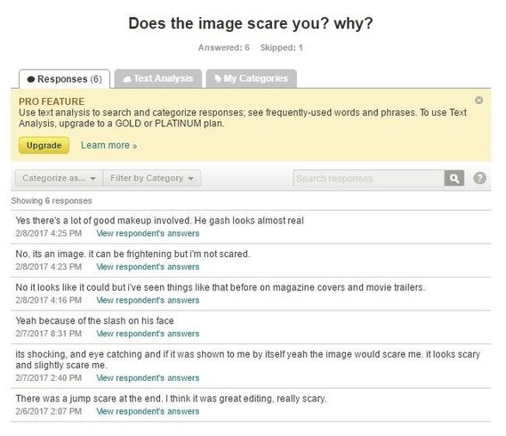
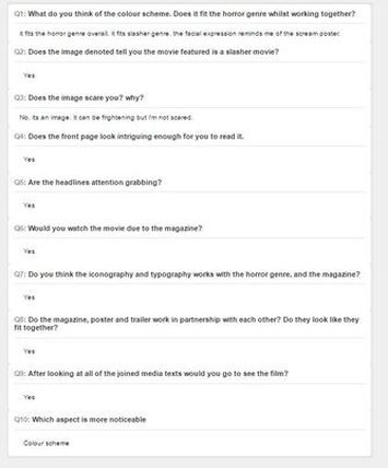
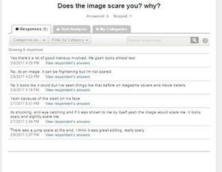
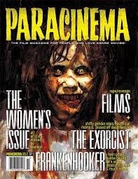
From the audience feedback, I have learned that the audience have become desensitised among other things towards horror denotations in the media. Their response to what would have one point scared people no longer has the same effect as it once did. A lot of the audience’s responses stated that whilst the denotation was effective in being shocking and eye-catching due to aspects such as the make-up. Overall it did not scare them because it was an image, which is understandable a simple image would have to involve quite a few elements to be scary to an audience consisting of 15 year olds. Those of whom have grown up in an era where they have constant exposure to media texts and so their response has gone from one lacking in a dominant/referred response and instead changed to an oppositional and active reading. Instead of considering the whole image for what it is and the effect it’s supposed to inflict, that being scary the audience now look at the image for what it is and reject it as anything more than an image of a gruesomely attacked protagonist. Overall, I’ve learned that having a main image with obvious elements that fit the horror genre is effective but overall it will not be considered as more than an image typically, especially on an audience in this era at that age (15).
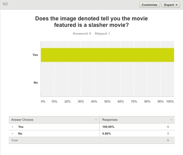
From this audience feedback we have learned that the audiences understanding of horror movies and its sub-genres can be considered as developed, more so when looking at the 15 age group. They understand the typical denotations that apply, specifically a bruised, cut up teenager with lots of gashes on their face. They may even understand the deeper denotations that apply to the slasher genre and the purposes behind them such as teenagers being denoted for the purpose of symbolizing puberty and the evil that was once perceived around it regarding teen impulses. i.e. promiscuity, alcohol abuse, substance abuse, rebellious behavior and how this was frowned upon. Perhaps the audience do not understand it to this length, but the feedback does show that the audience do understand that those conventions belong to this sub-genre and this sub-genre alone. Another conclusion I can make from the data is that perhaps the conventions have been over-played and over exposed, the respondents involved in the questionnaire are 15 their understanding is expected however it could be argued that it may be time to go against or develop this convention if the audience are so easily identifying it.
From this feedback, we have learned the best way to catch the audience’s attention is by making sure the boldest parts of the media texts are not only denoted in a way that is advantageous to the media text. i.e. the title of the movie is shown in a clear and obvious way but the overall cover itself needs to have an eye-catching color scheme and main image. In other words, adhering to typical denotations of the conventions are the best way to appeal to the audience. i.e. the main image being a character from the movie, one of the main characters. The color scheme being three bold colors. The title of the movie being denoted etc. We’ve also learned audiences are open to reading horror magazines however the magazine has to be intriguing enough to truly be appealing enough to buy.
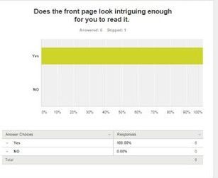
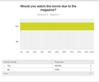
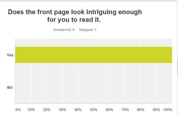
From the feedback, we have learned that the audience’s response to the front page of a horror magazine is more than one that is passive and strictly attentive to the visual denotations alone. The audience do also consider the aspects involved in the front cover and whether or not they like them, again this is a reception theory negotiated/oppositional reading. Thus, I have learned that the text/articles involved do need to be just as intriguing as the front cover. However, the severity of this statement is questionable considering all of the respondents said that they would still view the rest of the media texts and purchase the magazine.
|
From the feedback, we have learned related media texts do have an effect on each other. If one is successful it is most likely going to lead to the audience wanting to see the rest of them.
|
|
|
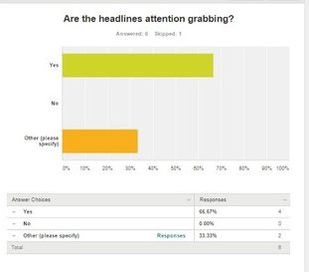
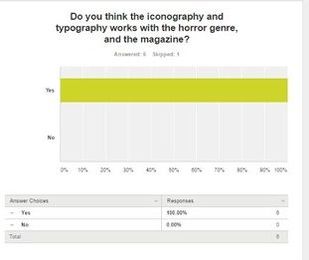
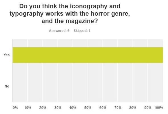
From this feedback, I know the audience, much like with the denotations concerning the slasher genre do understand and consider the aspects that go into horror magazines. Including the type of fonts used as well as the visual images and symbols used. They are able to understand what type of typography and iconography fit the horror genre and which do not.
Therefore, I have learned this aspect does hold some importance to it and effect the way the audience would perceive it, for example serif font usually used for newspapers would most likely not be perceived positively if used in a horror magazine. |
|
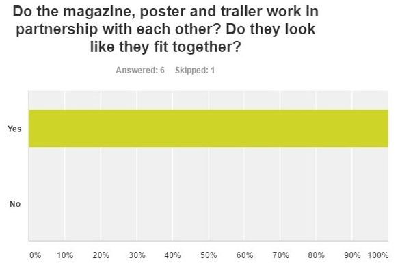
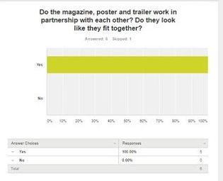
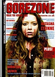
From the feedback, we have learned the audience are able to identify the main conventions that can be used in each media text in order to make them connect with one another. For example, the typography used for the title slates, and the movie title are all the same. They all use the same colors of red and black and font style also. The same goes for the color scheme, although the magazine has an additional color of yellow, an aspect added so that the magazine would stand out more.
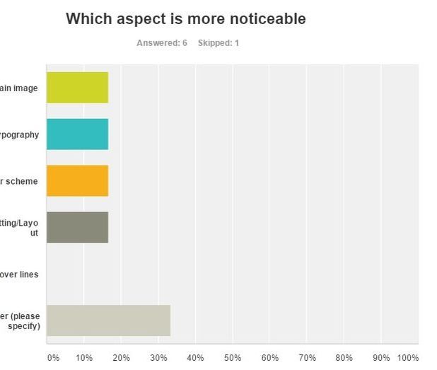
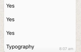
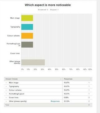
From the feedback, we have learned that whilst one aspect may be generally perceived to be more attracting than others (main image usually) this is not actually the case. Our audience gave an extremely varied response when it came to which aspect was the most noticeable. Therefore, we have learned that not only do the audience once again have a more active perception upon magazines that go further than simply regarding what is denoted but also judging it. But, the magazine needs to be equally effective when denoting all of its aspects due to the active perception the audience has. Whilst some features are typically bolder than others, the less noticeable aspects are still observed and so need to be used purposefully, for example they need to have the same color scheme as this can assist with the media texts being linked to one another.
Trailer
Our Synopsis:
The movie is one centred around teenagers abuse of alcohol and substances. throughout the trailer they're shown to face their drunken forms as their killer. Ultimately symbolising their sinful behaviour towards these vices consuming and finally killing them. A group of teens get dared to commit a breaking and entering felony, and end up breaking into and spending the night at an old abandoned (or so it seems until they meet the antagonist) police station. The teens enter the establishment frightened and scared, but they know leaving is not an option due to social pressure and so they instead try to treat their fears with substances and alcohol as to calm their nerves, all whilst unknowingly being watched by 'the collector'. This leaves them in a less than functional state and they all fall asleep, events pursue quickly after this with each of the characters being targeted and being put through their own personal brand of hell as they try to battle their demons.
One friend (Josh 'the jock') decides to stay awake through the night and continue his consuming of the substances whilst the rest of the friends decide against this. He stumbles around the establishment until his fondness towards spending the night hours drinking has left him unresponsive and whilst he does not know it they sleep on the ground. He 'wakes' up but still feels the effects of alcohol and so again stumbles around until they are all viciously and brutally killed by their own personal killers.
For the girls (Emma and Charlie) who decide to stay in the abandoned police station the night of mayhem first begins with the group of teens quickly splitting up and going their separate ways for the night. The girls decide to go to sleep due to them wanting the night to be over as quickly as possible whilst the other characters decide to continue their escapades in drinking and consuming substances. The girls quickly drift to sleep but it isn't long before one of the characters 'wake' up and find themselves alone and become frightened. Their slow panic becomes pure fear when they realise that they are not alone but trapped with what can only be described as a menacing figure. She is attacked by the antagonist and her night ends with death. Her bunkmate and friend sleeping soundly besides her does not realise that her friend has been killed in her sleep and has a dream of her own, she wakes up covered in blood that she realises is not her own. Understandably freaked out by the blood she runs to the bathroom to wash it off where she is confronted by the same killer that killed her friend, however her fate is different from all of her friends as she is the final girl. She fights back against her killer and prospers, she wakes up after and finds her friends all murdered around her. She is distraught and seemingly freaks out although quickly composes herself as she realises she needs to leave, before she does that however footsteps are heard in the background drawing nearer. The antagonist is shown and the two appear to be squaring off against each other, the fate of the last protagonist (final girl) and the antagonist are left uncertain as a cliff hanger is the final piece of the movie.
Inspiration: We took inspiration from Nightmare on Elm street as this used a similar concept to the subtext we were trying to portray and get across.
|
|
|
Our Survey:
|
|

|
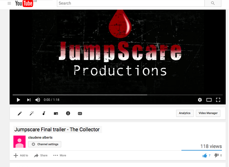
You Tube was launched in May 2005, YouTube allows billions of people to discover, watch and share originally-created videos. YouTube provides a forum for people to connect, inform and inspire others across the globe and acts as a distribution platform for original content creators and advertisers large and small.
|
|
|
|
|
|
|
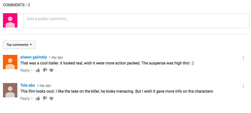
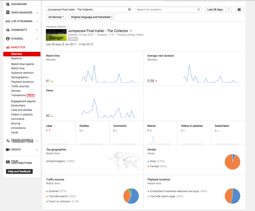
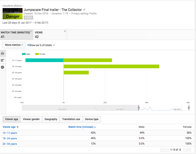
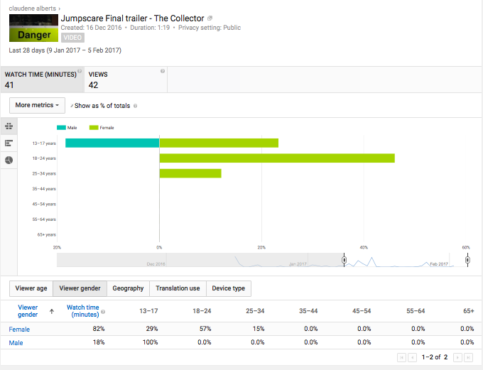
These statistics show that many people have viewed this trailer both female and male however this shows that 82% of the viewers are females, this shows that this targets this audience a lot more then the male audience. We have also had views not just from England but from other parts in the world such as South Africa, this shows that other people from other cultures could be interested in this film trailer as well. All the comments left were positive and therefore shows that we have hit the majority of the viewers needs and expectations to a horror teaser trailer.
|
|
|
|
Facebook is an online social network service. This was founded in 2004 by Mark Zuckerberg. This social network allows anyone above the age of 13 years old to be a register user of the website. Facebook allows friends and family to communicate all online, different ways this could be done is by sharing photos, videos, links and texts. Facebook is very popular as mostly everyone knows about this or even use it. This is a great way to gain feedback from our audience as this social network can be accessed by anyone on any device.
|
|
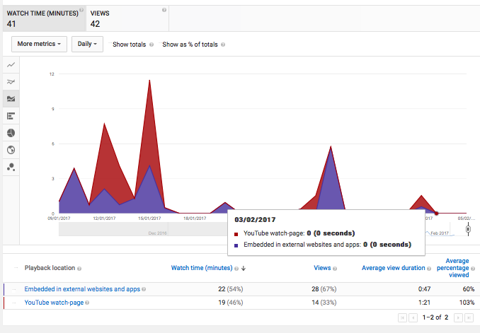
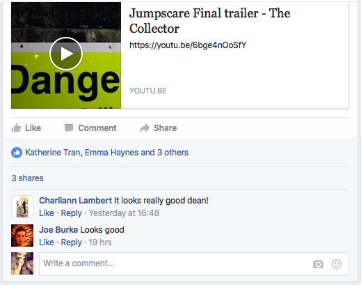
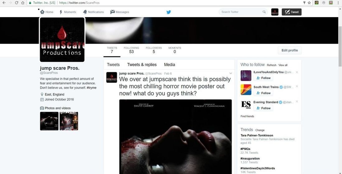
Other social networking sites have been used to get around the word that we have created a teaser trailer, this could be a way to advertise the realign of the film as this social networking site in particular is very popular. These screen shots shows how our trailer has travelled to different people using the Facebook share option which allows more viewers to come across it. All the comments left in the comments area were positive and therefore shows that we have hit the majority of the viewers needs and expectations to a horror teaser trailer.
|
|
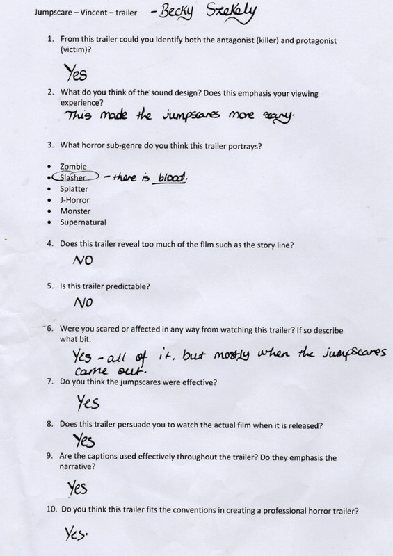
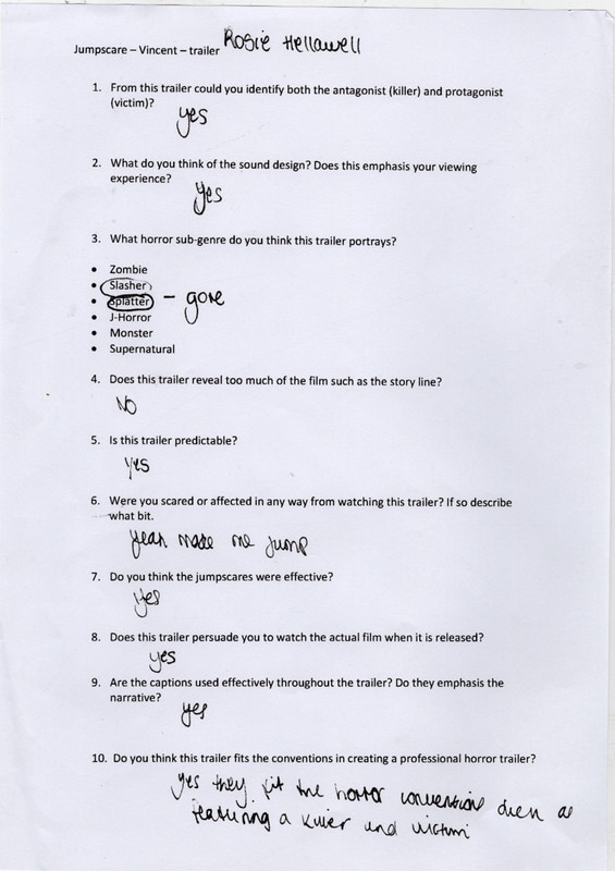
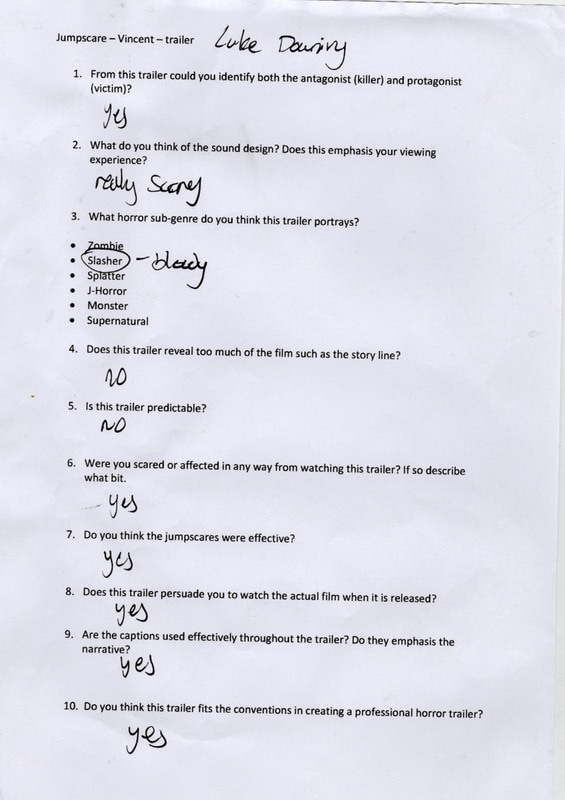
Survey Monkey Results
|

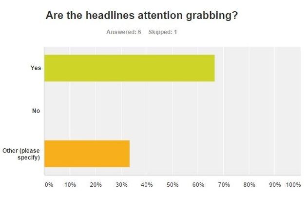
Majority of the people said that the captions used were effective towards the narrative, this is good as everything should make sense due to its structure.
|
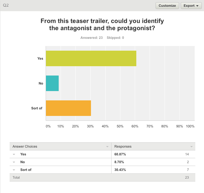
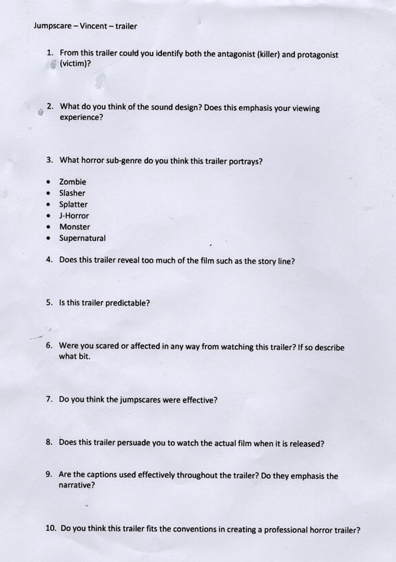
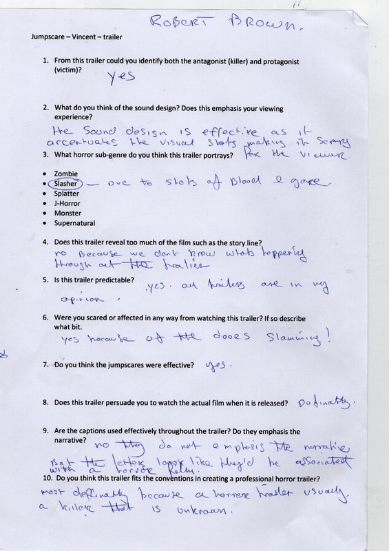
Just over half the audience said that they could identify the antagonist and the protagonist, this show that we should've made the protagonist more clear throughout (having her fight back), however not being able to identify the antagonist is a good thing as in a tease trailer this shouldn't have shown his identity.
|
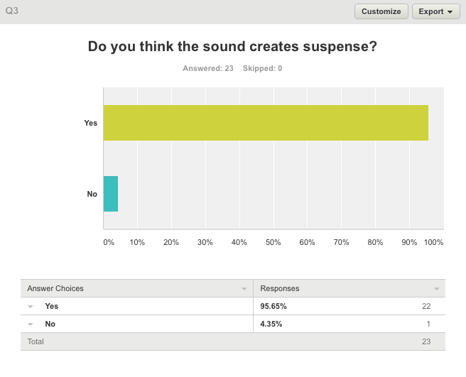
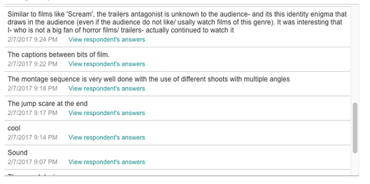
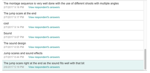
Out of everyone that had put their opinion forward, 22 out of the 23 people agreed to the sound creating suspense, this shows that the sound was appropriate to how we were trying to portray the trailer.
|
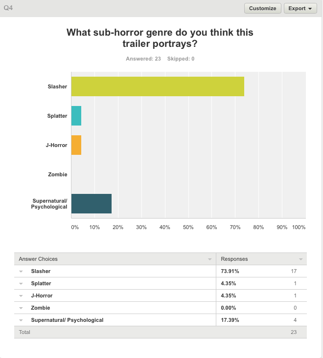
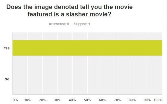
This question was asked to see if the audience knew what sub genre the trailer was trying to portray. Most people chose the slasher genre which is correct however some people chose the other sub genres which shows that our trailer might not have been clear enough to show that its a slasher and therefore to improve this we should've included more shots of the weapon and more blood to make the slasher genre easier to define.
|
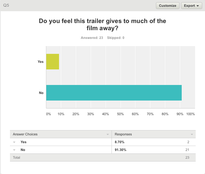
21 out of the 23 people who have completed this question said that the trailer doesn't give to much away. This is what we are trying to achieve as if it gave to much away the audience wouldn't want to see it when its released as it would be predictable and wouldn't build suspense.
|
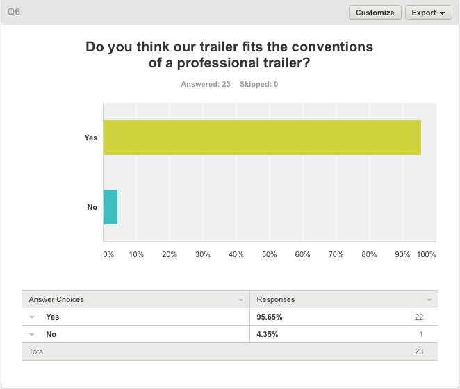
Majority of the audience responses said that the trailer fills the conventions of a professional trailer, this shows that the main effects such as the montage/ titles, jump scares where all affective and therefore the structure used was correct.
|
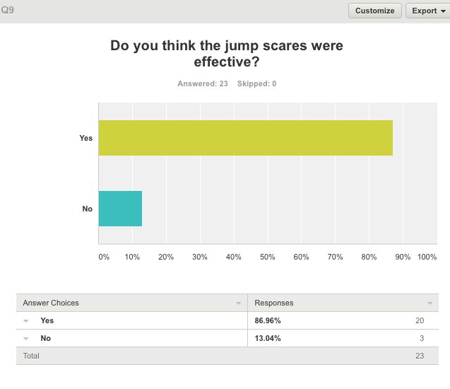
86.96% of the people who anwsered this question siad that the jump scare was effective, this shows that the trailer is therefore successul as a horror trailer as it has scraed some of the audince, however the jump scares didnt seem effective to the other 13.04% of the audince, this may because these horror fans are desensitized to the scary jump scares and thereofre these parts dont effect them in the correct way.
|
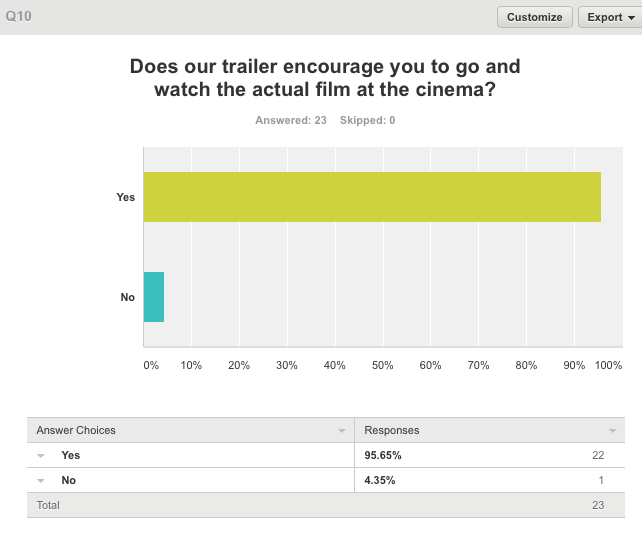
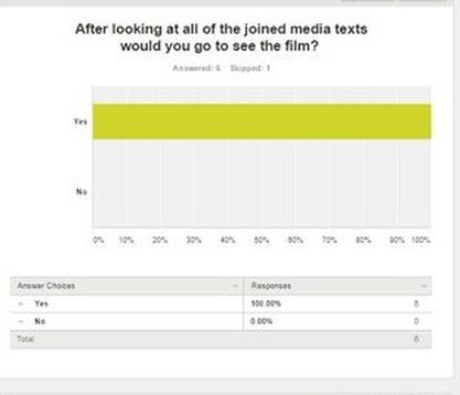
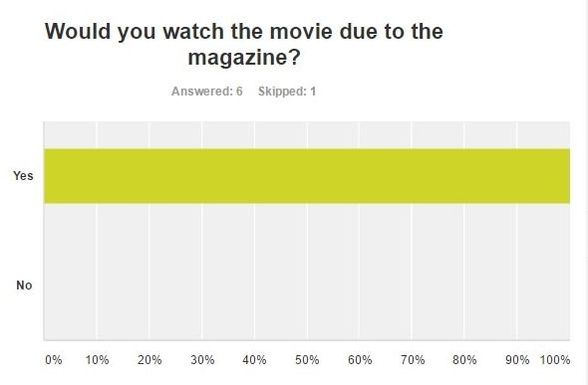
in conclusion 95.65% of the audince would go and see this film in a cimema when its released, therefore this makes it a successful trailer as most of the audince want to see more/ want to see what happens.
|
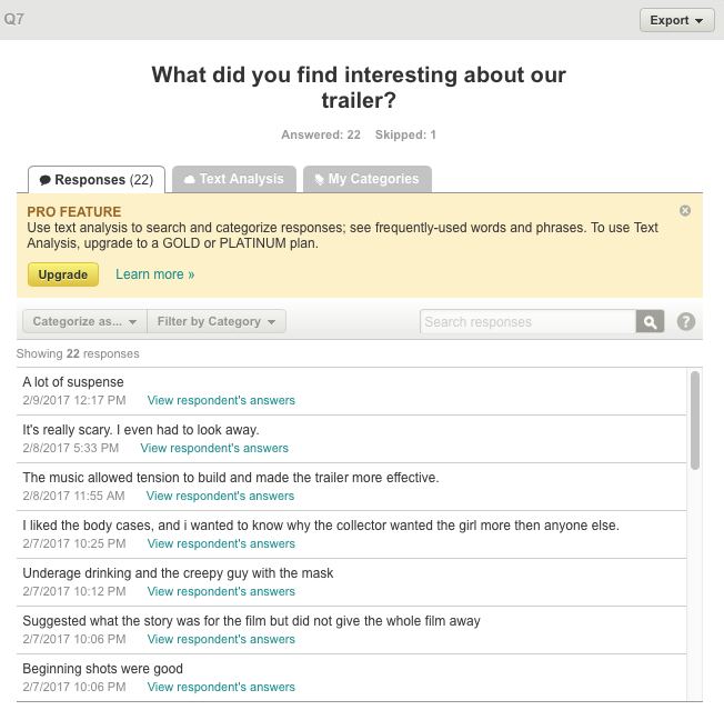
These responses from survey monkey has shown that throughout our trailer the jump scares were the most effective as this effect has been created using the sound design that builds up the tension as someone said "Its really scary. I even had to look away" this shows that visual pleasure that has been created. This makes more people want to experience the whole film.
|
|
|
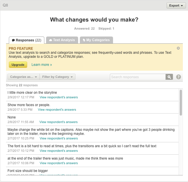
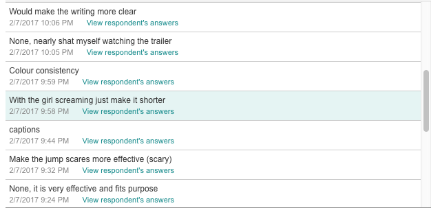
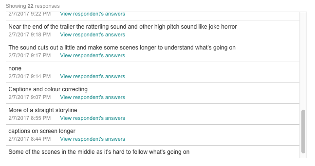
Some of the responses that we gained from the improvements that we could make if we were to redo the trailer is stuff like the colour correcting throughout the scenes showing consistency and the captions should be left on the screen longer allowing the audience enough time to read it and gain the best effect. some comments have shown us that the audience likes what we have created for example the comment that a viewer had stated that there was no improvements as they said...
"None, Nearly shat myself watching the trailer." which shows that the effect that we are trying to get across have reached the approval to some of the fans. |
In conclusion

|
|
|
|
Real Life Reactions - Vincent
|
|
|
Physical Survey's Completed - Vince
|

|