
Magazine Front Covers Analysis

|

|

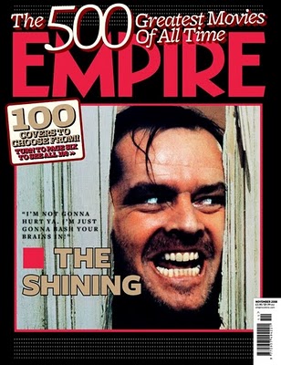
mise-en-scene: high key lighting, it really adds a lot of emphasis to the expression on his face, with a manic deranged and outright creepy look. however he inst looking directly at the camera, directly at the camera rather at someone. thus the feeling of panic that should be created by looking at this slightly insane looking man who seems to crashed through an enclosed space doesn't quite arise within the audience.
camera angles/shot size main image: the camera angle is a mid-close up showing just a little bit more than the characters face alone. the shot size is medium close up. the main image is within more of the left thirds space with the text being above and to the right of the main element of the image. http://www.fandango.com/scream_2308/plotsummary
camera angles/shot size main image: the camera angle is a mid-close up showing just a little bit more than the characters face alone. the shot size is medium close up. the main image is within more of the left thirds space with the text being above and to the right of the main element of the image. http://www.fandango.com/scream_2308/plotsummary
