10 magazine questions
1. What colour scheme should be shown?
|

|

|
|

|
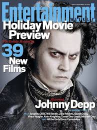
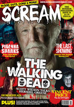
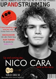
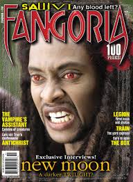
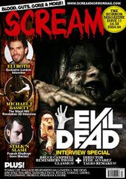
2. should the main image be a shot for the magazine be from the movie or the poster?
|
|
3. Should the masthead be similar to the font of the movie title?
|
|
4. How many cover lines should be shown? 1-4 4+?
|
|
5. Which approach should be taken with the magazine (minimal or detailed)
|
|
6. Should the page be designed around the image or vice versa?
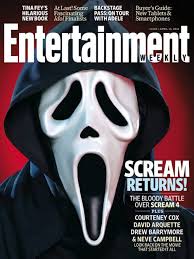
the mastheads behind the main image, all text doesn't clash with the image and is to the side. the main focus is the image. Is this what you want to see?
|
the masthead is over the image, the magazines text takes the most attention. the text is over the image.
Does this appeal to you more> |
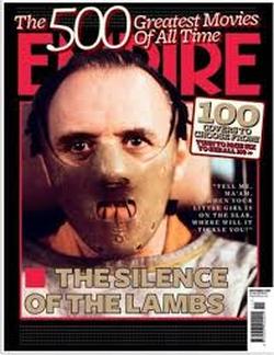
7. Should the image (if it features a person) show direct address to the audience?
|
|
8. Should more than 1 image feature on the page?
consider:
Does more than 1 image take away from the magazine
as the audiences attention is in more than one place?
does more than 1 image make less of an impact?
If the images are on different articles does the magazine look messy?
Does more than 1 image take away from the magazine
as the audiences attention is in more than one place?
does more than 1 image make less of an impact?
If the images are on different articles does the magazine look messy?
9. should the magazine feature a strap line?
10. Should the text (masthead) or the image grab the most attention?
|
|
Answers for the magazine questions above as shown through twitter.
|
There are two Jump scare pros twitter accounts in here, but their answers are different making the amount of audience members 4.
|
the figures in orange correspond to the amount of people who opposed this idea
Conclusionin conclusion what the feedback is saying is that they mostly want typical denotations on the magazine, they want to be able to recognize the magazine as a magazine without too much happening on the page. they want the simple typical approach (this is concluded from the feedback on questions such as the questions about the coverlines that should feature on the magazine, most people thought that it shouldnt be too cluttered they wanted information but they didnt want paragraphs. also, the question about the layout working around the main image or vice versa. everyone said that they wanted the magazine to work around the image. most likely, because the other way around is not the standard approach for most magazines, if text is stacked on top then it really makes the photo look irrelevant, most of the questions follow this approach also) overall
|
10 poster questions (as answered through snapchat and whatsapp)
To fully view the answers to the questions (shown below) scroll to the right and click full screen)
 |
There are some answers missing from the audience in the question, they noted to me that this was because they could not make a decision on these questions.
|
Conclusion
As shown from the data collected here there are a few approaches to the poster that the audience feel the same about as a whole that can and will be taken into consideration with the poster. for example:
1. The first question is one that's rather split in terms of opinions most of the audience liked the detailed and the minimal approach, the audience liked both ends of the spectrum and so in conclusion on the poster will take more of a middle approach between the two with a basic approach in some areas such as text but the picture may be minimal. The feedback is saying that the audience like something that's visually pleasing but isn't too cluttered and can also get the message across understandably.
2. The second question isn't divided like the first question at all. all audience members who answered the question said that they'd like to see a tagline involved, taglines are a great way to get the message of the movie across without actually watching anything and in addition to this depending on how good the tagline is people can often find it haunting and scary amongst other things, this is exactly what we want and thus our movie poster will. The feedback is saying that audience like a phrase, a slogan something that sticks with them and that they can remember and associate with the movie.
3. The audience members gave a mostly unanimous vote that the establishment should be shown and considering the fact that the trailer has to feature seems that action and actually get the message across that the movies a slasher the establishment (where the protagonists and the antagonists meet) will be shown. The feedback for this is that the audience want a certain level perhaps of suspension of disbelief they can believe that this situation and the events all happen but they want some of the smaller details explained, and considering the fact that the establishment is going to be a large part of the trailer its a good thing that the audience want this.
4. In conclusion for the amount of characters that should be denoted on the poster (we chose characters because denoting a simple and singular prop on the poster wouldn't be very effective in provoking fear, a person that the audience may be able to connect to will most likely work better) the audience gave a split view with some saying that multiple people should be on the poster (I believe that they've become accustom to generic teen slasher movie posters where all the protagonists are shown and perhaps there's floating heads in the background etc. such as the scream movie posters) and everyone else saying that it should just be one, although the latter opinion is most likely will work better and be more effective there's less distractions, and one main focus. The feedback for this question is saying that the some of the audience want to be surprised and completely introduced to the characters that will be in the trailer when they watch the trailer and perhaps others want to get an idea of who will be in the trailer so they can get a sense of the role that person will be playing. This could be because of past denotations, if there's a brunette on the poster for a slasher film we know shes not only the main protagonist but also most likely the final girl.
5. With analyzing the audiences feedback it has shown that in general they'd all prefer for there to not be a prop denoted on the poster, and when considering the fact that much like the antagonist the weapon that they use should be kept unrevealed otherwise it almost gives away a part of the fear that can come with the antagonist. The surprise is gone because people become accustom to the prop and the possibilities of terror that can be achieved with it. And so there shall be no prop on the poster. This feedback is saying that people want to have suspense, they don't want everything to be given away. a weapon, or rather a murder is a lot less scary when its been introduced before, much like an antagonist.
6. In terms of the protagonist being shown on the poster, its a split vote between the audience. although through research, general knowledge on movie posters and the fact that we aren't going to feature the antagonist or the prop there is the fact that denoting an protagonist is the only thing that we have left. Although this being said this isn't a negative thing, as long as the protagonist is denoted in a meaningful way that can be decoded by the audience or bring them in to watch the movie then its effective. t=The feedback is saying that the audience aren't quite sure on what they want to be on the poser (this isn't just concluded from just this question but others before it) perhaps the overexposure of such things has become the norm to some people and thus seeing it on the poster seems almost mandatory now, whilst others want something new, they want to be brought in by more than just the store power, or even the eye candy of the movie (our movie doesn't actually have any star power and even less eye candy but the denotation of the protagonist on the poster should be unsettling enough to leave an impact on the audience and make them want to see it).
7. This question is one that unfortunately the audience members weren't able to choose from, most likely because they all can easily be associated with the horror genre and slashers and thus can be applied generally to most posters. although, this being said through general knowledge it is quite easy to narrow the choices down to what posters shouldn't be chosen due to the fact that they work but are far too cliche and belong more in a time where horror movies were just starting out. they don't hold much meaning to them, these are 1,2,4,5, most of these don't hold any deeper meaning truly. whereas the 5th one at least with some extreme analysis can hold the meaning of the jagged edges looking like knifes. the feedback is saying, surprisingly that these audience members prefer the overly horror, edited and blood dripping with jagged edges for the curves of the letters type typography.
8. This question was one that was more for the information of the audiences preferences (it needs to be kept in mind that the audience that were asked question was a very small majority) more than anything. firstly, because of the fact that knifes are actually known to be a cliche, they've been denoted far too much as the antagonists primary weapon and on a scale of the most terrifying antagonist weapons they just don't compare to weapons such as chainsaws and axes. This question was mostly added to see if the audience knew this, in others words did they have an active response to the over exposure of this particular weapon or is it still passive, as the feedback shows the audience mostly have an active response, actually seeing them as cliche. the feedback is showing us that genre has changed and adapted over time, it takes more than a kitchen knife to scare people nowadays. the audience has become desensitized to this and they need something bigger, more shocking.
9. This question is one where the members of the audience that had been questioned (2 people decided they couldn't answer the question because both posters looked good to them) and did answer cast a mostly unanimous decision. Two out of the three that could answer said that they liked less words to the poster and thus the poster was rather minimal with just the main image grabbing most of the attention. I believe this is because of the fact that besides the tagline, title and maybe even the date most people really don't need to know about the rest of the information unless its about something such as the star cast involved. in other words its an unnecessary clutter and thus we will try to keep the text involved to as much of a minimal as possible. The feedback is saying most likely that the audience want to look at things that are most likely attention grabbing (once again this conclusion isnt just made off this question but others also) and actually have meaning to the movie, they want visual details shown through the picture not information that they can find out in other places, such as a magazine article.
10. This answer was a unanimous vote by all who participated (2 didn't answer the question because they didn't know) all three said that they liked the effect and would want to see it on the poster. Although this being said the example given is a good example of a poster that has correctly used effects to enhance the look of these posters, however there are also posters out there that have used effects very badly. Often overly emphasizing the main image, or exaggerating the tension and fear that's supposed to be felt to the point where it seems slightly ridiculous. although, this still being said the feedback is saying that the audience do like an extra edited aspect to a poster, they do like to see more eye catching detail that works. thus, an effect may be used on the poster depending on what the main image includes.
10 trailer questions. as answered through messaging apps
|
|
the pie charts where made using four people.
ConclusionIn conclusion the overall feedback from the audience is that they're all mostly looking for the same thing. To elaborate what the questions are saying is that they want a trailer that seems to vary from traditional trailers to something that's new, exciting and something that doesn't exactly fit the cliche stereotypes.
To elaborate, for the look of the trailer a lot of the feedback says that they want something new and exciting, something that's vibrant and visually pleasing whilst other feedback says that they want what is typically always denoted but still works in terms of horror movies, this is a conclusion from the responses on questions such as the colour scheme question a lot of people chose the atypical choice of what would feature in the trailer saying that they wanted the colour scheme that featured the most vibrant colour, orange. whereas with other questions they choose the typical, most expected answers. For example with the question concerning how much blood and gore people wanted to see, everyone said that they wanted excessive amounts of gore and also the question concerning whether or not suspense is more important dialogue (the form that would most likely easily explain the actual plot of the story. In conclusion i can conclude that the audience are mostly saying that they want a mix of traditional and modern/experimental. They want to see all of the gold old aspects that make a horror movie trailer successful, such as a jump scare at the end (something that leaves a lasting memory within the viewer, a ending bit of terror) a lot of disequilibrium action shot situations and not exactly establishing the characters so much as establishing the very base of the plot. Most likely this is because they have become desensitised to what is typically denoted in horror trailers. Thus, in the trailer there will have to be easily noticeable elements that the viewer can easily decode as a typical horror movie trope but new elements also. Which shouldn't be too hard to make as there are many areas that can be changed and experimented with so that they create something new, to elaborate with editing there can easily be a new approach taken to the editing so that it isnt typical such as slow motion perhaps, fast motion to build suspense tension or a sense of anarchy within the situation. Even with camera shots there can be a new approach taken such as a handheld approach so that the viewers feel less disconnected from the situation, the protagonists can look directly into the camera. The viewers can see fully their panicked and terror stricken faces with direct address. |
Mood boards
Slasher genre mood board in relation to the trailerThe slasher genre has been chosen to be used because of the key elements that it carries that are easily identifiable and to some extent greatly loved. for example the excessive amount of blood and violence that features in some slasher movies is a key element that the audience love, the exploration of that amount of anarchy happening on screen is something that people respond well to and we will do this by using different aspects such as the setting, most of the trailer if not all will be taking place in a creepy old abandoned warehouse because they are a setting that causes the viewer emotional stress just by looking at it. An abandoned warehouse is far too big to have nothing in it all the time, people start to become paranoid at the vastness of the premise and what could actually be behind a door and this is why we will be using it. Also, warehouses natural start to get an undeniable vast run down look to them that can easily be used in the trailer
Also abandoned warehouses, teens in trouble and a killer on the loose are all things that are applicable to this world, they can be real and until coming face to face with the situation or being shown what can happen in that situation all of this isnt necessarily scary. The audience are able to explore and escape to a place where its safe for their minds to roam and explore the less socially accepted, and scary questions of what it would be like to be in that situation from both ends. the antagonist and the protagonist. Also these factors from the typical slasher genre will be used because of our desired target audience, teenagers will best relate to, understand the struggles of and connect to other teenagers. Also the key elements of the slasher genre such as a group of teens, the use of drugs, alcohol and other substances as well as the society expectations of responsibility and the continuous on screen denotations of just how young adults/teens are supposed to act is something that they can understand and recognise also. |
 |
Set design mood boardThe setting will be an abandoned warehouse as abandoned warehouses already have a sort of menacing feeling about them, they naturally rust over time and the continuous mental note that this place was once inhabited and now for some reason is not can be something that adds to the natural horror of the setting, also the size of the warehouse is something that can create thoughts of not necessarily being alone in a space that big. every creak, crack and sound leads the mind to a state of paranoia from being in a space that big, in other words its almost as if they're forced to have a fear of the unknown of whats out there.
The scenes that can be shot here can be largely varied, for example a chase scene down a corridor, a protagonists attempt to hide in a room that seems empty but at the same time seems as though the antagonist could burst in by using some unknown entrance and a large splatter scene where the walls could be covered in heaps of blood. also the space provides camera angle possibilities if needed and if possible, high angle shots can be used due to the high ceiling and entrance shots could be used because of the large area of rooms where it is clear to see who's coming in. Also there is the fact that within teenage horror movies/slasher movies there is always a creepy abandoned place that the teenagers inevitably go to for some reason that will ultimately be the place of the characters demise. an abandoned warehouse fits this trope almost perfectly. |
 As shown here in these trailers for other movies the set design is something that has heavily influenced the choice of our set design. For example, with the saw trailer the set is perfect for building the type of atmosphere that would be connected to the crazed type of psychopath with a control issue. the type of setting that can easily make the audience unsettling simply just by looking at how unclean it is. in addition to it the setting is big just like the setting for our trailer will be, as shown in the trailer people are seen running around, trying to escape this maze-like prison where they're being tortured. the warehouse will act as almost like a torture chamber or torture house, its a place of complete terror and menace as well as danger, this is shown in the hostel trailer as well, its quite literally a place where every room is filled with horror and i believe that a warehouse has the potential for that (also as the trailer shows the antagonists is the human monster, the potential for the human mind to turn twisted and be capable of such horrors. which is something that has both influenced and will be a small part of the underlying sub-text of the movie)
|
 |
 |
Sub-text. underlying message
Getting high is an experience that a lot of people can relate to especially teens as it is most popular amongst them as well as young adults, they have time and money to spend on drugs. Also within the media particularly its viewed as something that's almost humorous and funny. something not to be afraid of but go towards as its often shown to make that person cooler, less stressed, a better or just different version of their regular selves. a regular versions that in contrast is usually shown as very uptight, secluded and wimpy or just uncool.
Some view cannabis to be an emotional and overall mental state enhancer rather than an escape device , making them feel better inside, calming them down and giving them a sense of serenity, heightening the feeling that you have positively usually.
Teen substance abuse will be used as the sub-text due to how increasingly popular its becoming. nowadays its extremely easy for someone under the legal age to get their hands on alcohol and drugs and even easier for them to continuous indulge themselves in these vices until it comes to a point where this is normal and something that feels like the answer to the problems that they have, which at that age where they're seen as children to some and yet to others they're supposed to have the ability to make grown up decisions and uphold adult responsibilities (an idea that may be explored in the trailer) their can be quite a few. the overbearing feeling of life changing around them and not necessarily for the better is something within the media that they repetitively denote, thus the audience seeing this on screen within our trailer is something that they should quite clearly understand.
Also it leads the audience to understanding just why they end up in the situation that they do due to teen punishment.
Props mood boardThe main weapon for the movie will be a knife as it is a stereotypical weapon within the slasher genre, its a phallic object and the majority of the protagonists in the trailer are female therefore it holds a certain type of sexual connotation to it considering the fact that they'll be penetrated by something that is a physical metaphor to a male sexual object.
|
 |
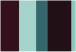
Colour schemeFirstly we will be using these colours for our colour scheme because of how they'll impact the movie. Both through the use of them in the movie and the ideas that they'll connote through being used and the way they affect the movie and the way the viewers respond to it. for example, they affect the viewers and there response due to a number of reasons, one being the fact that the colours (by themselves) aren't necessarily bold colours, they're practically seen everyday at one point or another and so the audience see them but doesn't truly register their presence until that presence is made truly noticeable. For example, during scenes that involve extreme action, such as a chase scene or a scene where the antagonist and the protagonist square off these colours being involved can be signifies that signify perhaps what will happen and to whom.
Red symbolises shock, terror, gore, fear, passion and fire, all of these things more or less connect to horror genre, either the fear of the protagonist in the moments leading up to their death, fear that generally in horror movies reflects back onto the audience if they find themselves relating to the protagonist enough or find themselves feeling/understanding the assumed feelings of the antagonist as he takes his/her latest victim ( as an antagonist can be said to feel a sort of manic, crazy desire that burns passionately for killing to a certain extent.) or the general feelings of most members of the audience as they watch this bloody gory show unfold on the screens. feelings that the producers intended the viewers to feel. Black symbolises very known connotations, it symbolises death, mystery and evil all very known connotations within horror movies and its denoted largely in other slasher movies and horror movies in general that i have looked at. White on the other hand in contrast to the other two actually connotes ideas of purity, godliness, and in some movies its used specifically in terms of innocence such as virginity which is specifically why it will be used in the trailer, its a known fact that when pared with the other two colours they contrast quite well in a visual sense as well as a symbolism sense, its a common known binary opposition. |
 The reason i went against the information given in the "wtf happened to movie posters" clip is because of both personal interest and because of what was collected from the audience research/ whist the clip does give interesting and helpful text all of these things aren't set in stone because theres too many variables, variables such as the fact that times change, peoples demands and way of thinking changes (whilst some people like to look deeper into the meaning of just why these colours have been used some audience members will look at something and see it as just that (which is something that can happen with the younger end of the spectrum for the target audience) they want something obvious in plain sight, and yet fits with the message thats trying to be shown. black=death, red=blood or danger and white=purity all of which do fit with the subtext of the movie and the genre) and the audiences needs and expectations change. As well as this it needs to be kept in mind that the movies posters colour schemes involved in the video are from movies with giant budgets (not necessarily spent on the poster as mentioned in the video) or at least budgets bigger than our own. They are able to apply this colour scheme throughout the whole of the trailers and the movies, we on the other hand have to make sure that the colour schemes can be easily involved (not in plain sight but obvious enough that the audience can pick up on them) both in the posters, the magazines and not to mention the trailer itself. Almost all the aspects of the trailer have to feature the colour scheme in some way whether it be with the costume, the settings, even the props and editing may even feature the colour scheme if we so choose. Also theres the fact that within the (around) 1:00 minute trailer there has to be enough mise-en-scene codes in terms of colour denoted that can be decoded by the audience. However, this being said there are some elements of the video that will be taken into consideration such as two colours that work well together (in the video it was teal and orange). with our colour scheme black and white, as said in the video "they contrast with each other" but not in an unappealing way, especially since its a horror movie. They work very well together and can just about work with everything in terms of the elements that they'll be featured with including characters and props, and red as another added element colour makes the page pop and stand out if its used right. Also as the audience research suggests from the first question of the poster magazine, most people respond quite positively to these 3 colours. |
CostumeThe types of clothing that the protagonists will be wearing are all used to connote the idea of them being rebellious but typical teenagers that have succumb to the expectations of society as well as peer pressure. they'll mostly look the same as most teenagers, most of the colours they'll be wearing will be solid colours that fit the colour scheme or compliment them whilst staying within the region of being normal teen clothes (such as grey denoted here in the thinglink for costume and red in the thinglink for colour scheme). To elaborate, the protagonists are all wearing 'normal plain teenage' clothing because we want the audience to relate to them, we want them to be able to put themselves in that situation and feel the fears of the protagonists as though it were them that could actually be in that life threatening situation facing their antagonists.
|
 |
Typography
|
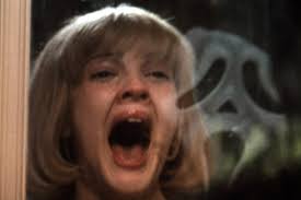
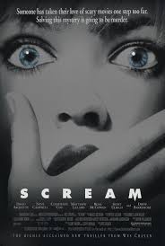
The typography for the trailer will be quite simple an easily decoded by the audience, although it will not be cliche. it will most likely follow the colour scheme in terms of the colour black so that it works on the poster and also on the magazine and trailer itself. The typography should feature jagged edges to resemble a knife (such as the scream poster) and should also have an affect to it, as shown in the audience research a minimalist yet detailed approach is preferred by the audience.
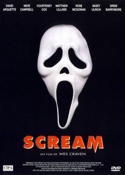
As shown here with the typography of the scream title the M is jagged like a knife, its the type of effect that we will most likely strive for. Jagged font very much constructs the idea of being in danger it something not being normal, its too bold and it stands out too much to be ignored.
|
 |
