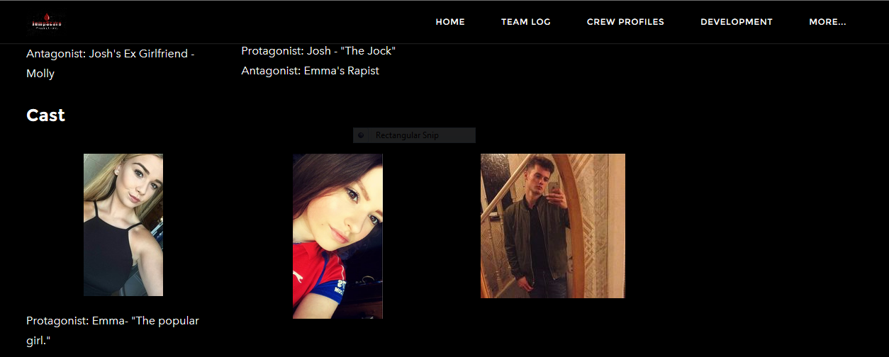
Introduction
Throughout this page you will be able to see our film "The Collector" presented across many media formats, along with inspiration from other media texts. We looked at the continuity, synergy and identity of all 3 of our products and ensured we gained a confident understanding before exploring paths of cross media convergence. Convergence includes new technologies, along with software's such as the internet, digital film, animation, smartphone technology, music, DVD (Digital Video Disk), video game consoles, along with high definition television. Media convergence is when combining different media platforms to create new forms of media expression. It is vital to have a strong brand for a horror film for many reasons for example, brand identity, franchise etc. In this page we will show brand identity for our film "The Collector", along with how this compares with real media texts.
Examples of synergy and media convergence.

Success of other real media texts
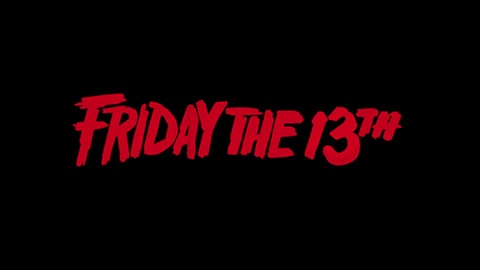
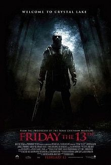
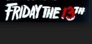
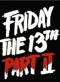
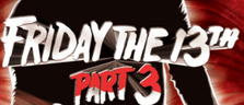
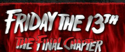
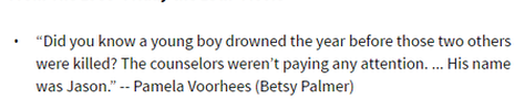
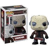
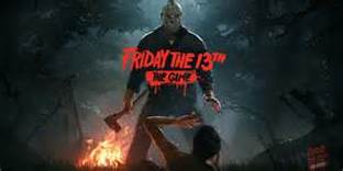
One extremely successful franchise in horror movies, is the globally known Friday the 13th. The movie has become so famous (especially with all of its reboots and spoofs) it has turned the very day itself into something that reminds people of the movie. The franchise has used Cross Media Convergence and synergy to the fullest extent throughout the years. Making products that match the time period perfectly, optimizing the amount of promotion and marketing they can possibly get out of the movies that are made.
|
|
The new Xbox one game to be released this year will most likely have a lot of promotion around it (it hasn’t been officially released yet), particularly because the game is working in synergy with the movie that is going to be released this year also. One aspect of the two products that display the strong branding of the franchise is the aspect involving sharing the typical similarity of having the same denotations. That being Jason and the colour scheme involved (and possibly the setting).
It matches the time considering game adaptations of movies are quickly becoming more and more popular. Even in the 1980s the franchise made products that fit the time period perfectly. When the original was released there was a lot of merchandise available, merchandise that again gave the franchise a very strong brand identity with the characters, colour scheme and other memorable aspects of the movie clearly displaying the same characteristics. For example, the lunch box and cup shown here both denote Jason, the antagonist of the movie. Additionally, the movie has become so popular that the products from the first movie are now considered memorabilia with them now selling at twice what they once originally did. In fact the franchise and its largely marketed products have become so popular in some senses that there are people devoted to finding them and collecting them |


|
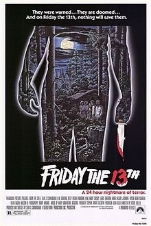
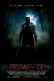
Even throughout the progression of the franchise the scheme and overall denotations upon the posters have stayed the same to the most extent. Jason is still the centre of attention on the poster, with the title working around him and with the same colour scheme even if it is to a lesser extent. And more importantly the denotation of the setting that creates a certain type of atmosphere is still denoted. To elaborate, an eerie woodlands setting upon a full moonlit, yet foggy night creates the tense atmosphere that signals the horrific nature of the film. This is still denoted on one of the latest poster from the movie franchise, much like its predecessor. Thus, once again the sense of familiarity with the brand is once again seen throughout the franchises products whether they be the main movies (and their posters) or the merchandise again. The denotation the public have become accustomed to have, as mentioned before, have made the franchise into what it is now.
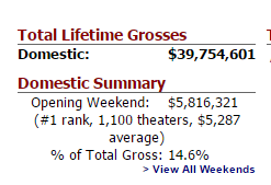
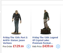
Both of the current released movies, Friday the 13th 1980 and Friday the 13th 2009 have a collective gross of £104,756,620 and that is from the movies themselves alone. That does not include the immense number of products and merchandise that they have. Especially in a yearly sense considering the antagonist ‘Jason Voorhees’ is a popular Halloween costume. |
|
Total gross of the franchise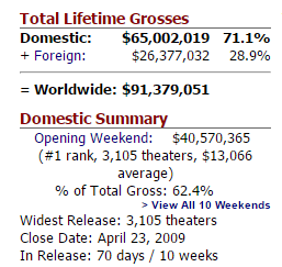
|
Merchandise from the franchise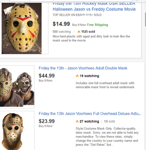
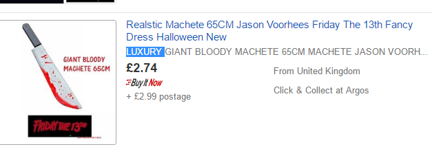
As shown here the branding of the franchise continues in its products. The machete belonging to Jason is shown covered in blood as it would in the movie, and as it is in the posters.
|
Considering the raw popularity of the movie, and particularly the characters and story line involved it Is easy to say that this film is in itself a classic, and one that will come to mind almost every time when looking at the earlier years of the slasher genre and what has now established it. From video games, to Halloween costumes and mazes themed around the movie the franchise is one of the, if not the most well-known globally. From the young to the old, the public can easily identify the movie and products from it due to the iconic costumes, designs and location as well as the familiar story line.
The franchise and its branding
1980,1981,1982,1983 Friday the 13th movie poster.
|
The franchise as with all others has the basic branding with it including the colour scheme which runs along black, white and red. As well as the typography generally being the same throughout all of its remakes. The franchise as with all others has the basic branding with it including the colour scheme which runs along black, white and red. As well as the typography generally being the same throughout all of its remakes
|
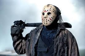
However as with most large and known horror movie franchises, Friday the 13th has an aspect to it that is iconic and overall is the very symbol for the franchise. The franchises branding pertains to mostly the renowned antagonist (that always seems to come back, one way or another) Jason Voorhees. He is a symbol, the very trademark for the brand, he acts almost as the logo for all of the movies. When the audience or even the majority of the general public see that notorious mask and machete they instantly make a connection to the movie, and consequently the franchise itself. Additionally, besides from Jason being an icon and known aspect of the movie there’s also aspects concerning the movie itself in terms of the story and the writing involved. For example, the rules that will get you killed in the film and the famous lines delivered in the movie.
|
|
|
|
On the toys and collectables the continuity of the brand can be seen with the characters all being denoted in the same way. All of the action figures are shown with the Jason Voorhees mask, jumpsuit/mechanic suit and machete.
|
|
|
|
|
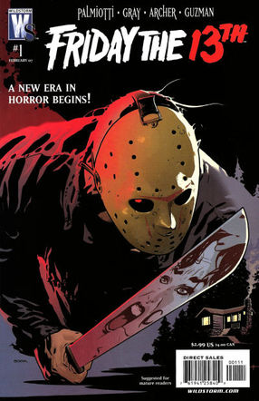
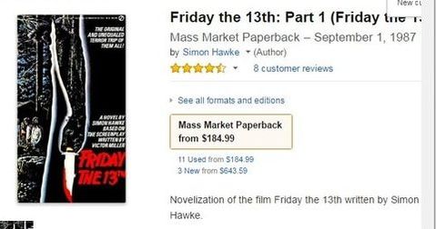
As is typically shown with most famous horror movies, or movies in general nowadays there are adaptations being made of the movie away from the big movie screen. The franchise has a paperback book of the movie as well as comics of the movie made also. This type of branching out into different types of entertainment services is perhaps what has made this franchise so successful and so large. The plethora of products produced surrounding the brand means that the franchise can and does market itself to more than one audience, more so than the movie legally can.
However, it does so in a way that keeps the elements of familiarity that the audience have become accustom and expectant of, in terms of the brand. To elaborate, in terms of the products such as comic books, this is a product that can be marketed and aimed at the younger end of the franchises audience, although this would most likely be dependent on the content. The comic would also have the same denotations as the film, merchandise and other products from the franchise, as well as aspects such as the same colour scheme, typography and possibly even the same style of iconography. Yet, it would be aimed at a different age range in terms of audience. By doing this the franchise has benefited from the advantage of appealing to more of the public, thus making themselves even more of an established and profitable franchise. |
Spoof/tribute remake to the movie.
|
|
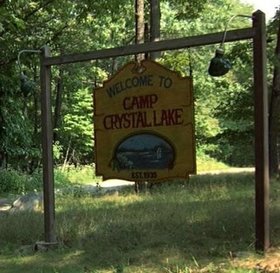
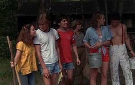
The original 'Friday the 13th' location and cast.
|
|
Final girls - A sort of tribute to the original movie, it features the same type of story line and characters as well as the same camp location.
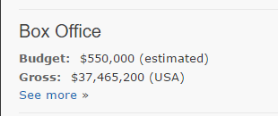
with a budget of 550,000 and most of that being spent on the marketing such as Variety magazine releasing an edition on their magazine with the movie being involved in that edition. The released title was “the most terrifying film ever made”. The movie grossed an estimate of 37M+ in the USA. Showing the sheer popularity of the film worked as marketing alone (The fact that it was rated X most likely had some assistance to the popularity at the time also).
The signature design of the movie is one that could be considered typical, yet because of the franchise being so established it is has become iconic and representative of the key elements that are familiar to the movie. For example, in terms of color schemes however it is still well known. With a dark night blue (the night sky) and black (sometimes the shade of Jason’s signature costume and the woods they are in) as well as the slight tones of white and green (white usually outlining things and the green being the color of the green plant life) and finally the well known denotation of Jason's mask and his trademark dripping blood machete.
The signature design of the movie is one that could be considered typical, yet because of the franchise being so established it is has become iconic and representative of the key elements that are familiar to the movie. For example, in terms of color schemes however it is still well known. With a dark night blue (the night sky) and black (sometimes the shade of Jason’s signature costume and the woods they are in) as well as the slight tones of white and green (white usually outlining things and the green being the color of the green plant life) and finally the well known denotation of Jason's mask and his trademark dripping blood machete.
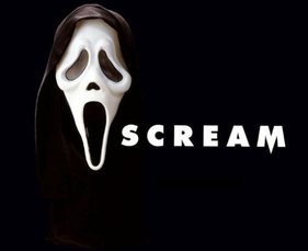
Scream
|
|
|
|
Another example of a horror franchise with a product much like our own (that being a horror movie within the slasher sub-genre) is scream, the 1996 horror classic that took a different yet memorable approach to the making of a slasher movie. With memorable characters, tropes, Gags and well written story line the franchise has blossomed into an impressive 4 movies. All of which include a lot of merchandise and memorabilia and even its own spoof (which could in some ways be considered a tribute to the movies) to match. Synergy and cross media convergence have been adapted to this franchise in an extensive fashion.
There is a consistent theme with the movies that has assisted when establishing the franchises branding.(red, white and black). The theme is one that can be put into the merchandise and products that come from it. Causing an element of synergy to be incorporated into the products because of how easily identifiable the branding of the franchise can be. |
|
|
|
|
even though the trailers themselves have advanced in terms of the aspects included. The typical characters usually shown, as well as the narrative of the trailers has to a certain extent stayed the same.
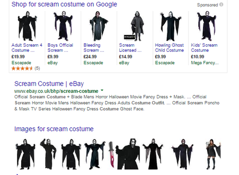
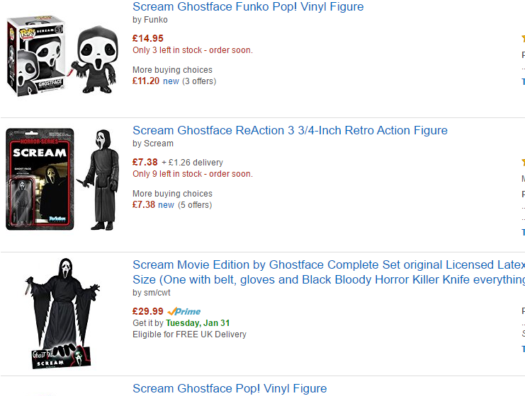
Scream costumer, Scream action figures and Scream toys. |
|
|
The franchise has a lot of merchandise, most of it revolving around the infamously well-known antagonist (Often being the movies signature piece de resistance considering mostly each movie has a character playing the villain) Ghost face meaning this can be an iconic piece of iconography. There’s a lot of merchandise revolving around the character as it is very memorable. In addition to this, much like the Friday the 13th franchise the antagonist has become a more than popular Halloween costume. The costume is actually one that is most likely based of the grim reaper. Even so just like Friday the 13th and ghost face the franchises massive success has resulted in recognition lying with the movie and not the grim reaper.
|
|
|
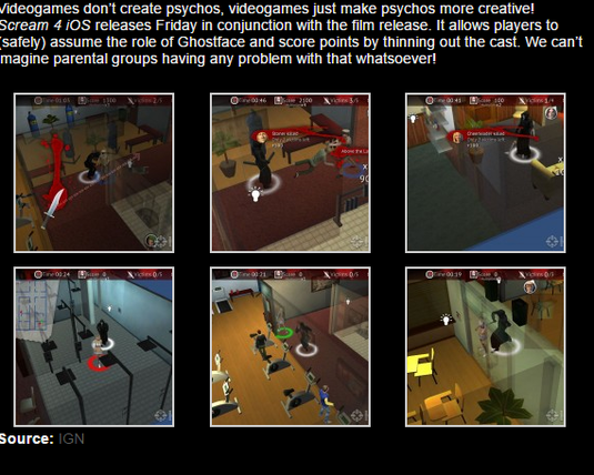
Official Scream Mobile game |
Scream themed TV show/reboot.
|
|
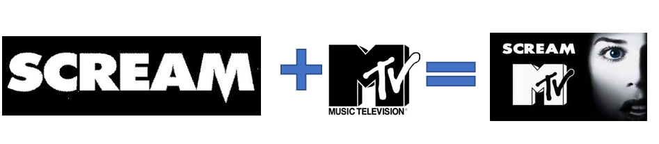
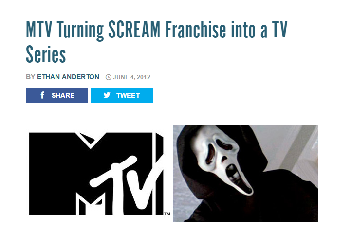
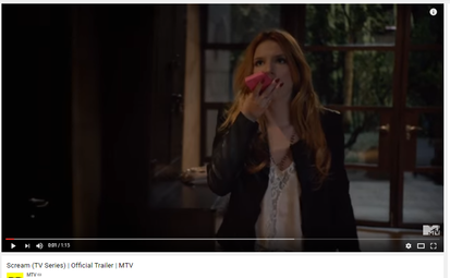
Another product from the franchise is the MTV adaptations of the movie into a TV series. There’s still the signature pieces of the movie however now a lot more can be done with it especially from a financial standpoint as the TV series allows for a lot more promotion and advertising to be involved. The reboot whilst textually and visually keeping the same denotations as the movie (there is still a deranged killer on the loose dressed in ghost faces's costume, a bunch of teenagers who are the victims and also possibly one of them or multiple amounts of them being suspected as the killer and finally a bunch of useless adults who do not truly help in the slightest) however there is a slight twist in terms of some of the elements.
To elaborate, whilst the majority of the show resembles the movie the show itself involves a lot of aspects that in an overall sense appeal to the current audience on a constant basis as it is a TV show. And, yet again, as with the Friday the 13th franchise this franchise can be seen making its branded products easily identifiable and familiar to the audience, giving further strength to the branding but it can also be seen as adapting and changing so that it can market to more than a specific type of audience. For example, with the promotional video example to the side the actors denoted in them are quite popular amongst the younger audiences, and this video was released before the actual TV show itself came out. The popularity from the familiar actors brought in the audience for the show itself. |
Iconography
Trailer & Poster.
An example ;
|
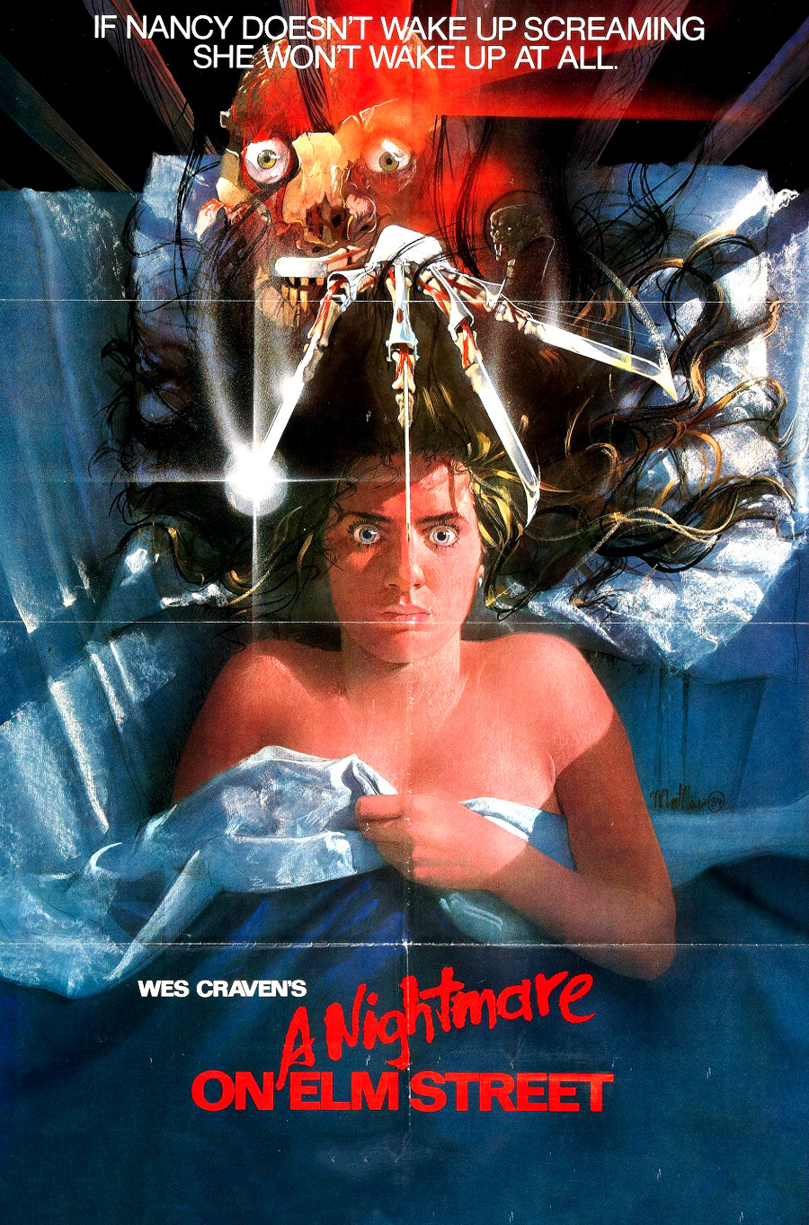
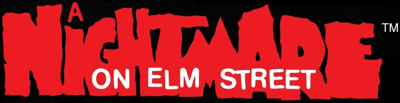
Font: The title fonts used from the trailer to the poster are identical in style and look. This type of continuity throughout the different media platforms are essential in order to make it clear to the audience that it is the right film. It creates a sense of familiarity with the audience as they have seen the font before from the poster and recognise through already watching the trailer. It creates a brand identity for the film that the audience become comfortable with and used to.
Colour Scheme: From looking at the thumbnail of the you tube trailer and the colours on the poster, you can closely identify the familiarities of cool tones that are shown. The titles throughout the trailer also have this shocking red that sticks out and draws the attention to the audience. Having the same colour scheme continues to create the familiarity that is so important when a film is released. Characters: Normally on a poster there is a main character from the film shown as the main feature that are also included in the trailer. Nightmare on Elm Street have created this look following the stereotypical view of horror posters, on the other hang they have also included a appearance of the antagonist higher up in the poster above the main protagonist in bed. This continues the idea of the dominance that the antagonist has over the protagonist, this Is also shown through the trailer. |
|
Now Ours.
|
|
Font : There is a clear consistency between the two media platforms that our film has been presented on, for example all of our titles in our trailer are set the exact same as the title on the poster. This shows that we wanted to our audience to have a familiarity with the film we are creating and it also helped create our brand identity.
|
|
Colour Scheme : We created a colour scheme by creating a constant look through all our media platforms, for example, we attempted to keep the lighting on the same parts of the face and show the shadows clearly too, this allowed us to emphasis the wounds we practised and created on the protagonist and antagonists face. Our colour scheme also allowed us to set a tone of our horror film and show what type of horror it was going to be.
Characters : We also made sure that we showed consistently on the characters shown on our media platforms like our poster and magazine, against our trailer. This helped the target audience familiarise themselves with who was going to be in the trailer and the type of characters they were going to be in the film.
Characters : We also made sure that we showed consistently on the characters shown on our media platforms like our poster and magazine, against our trailer. This helped the target audience familiarise themselves with who was going to be in the trailer and the type of characters they were going to be in the film.
Trailer & Magazine.
|
|
|
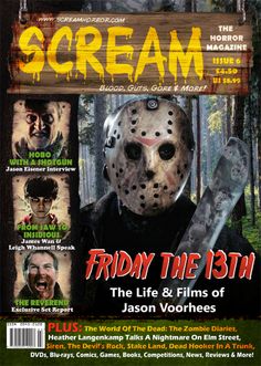
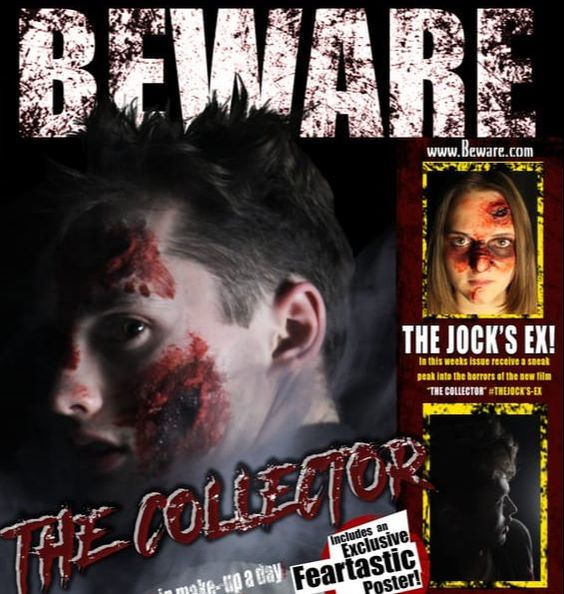
Font: There is a comfortable familiarity when it comes to the font of Friday the 13th magazine and the trailer. There is the similar colour and same font however because in the trailer there's only really numbers shown it only indicates a slight familiarity with the two linked together, however the familiarity is still present.
Colour Scheme: The colour scheme is also similar in the magazine from the trailer, for example in the trailer there is the setting of a forest and lake. These similar cool colour tones are also presented in the magazine "SCREAM" that has a feature of Friday the 13th in.
Characters: The masked antagonist is the main feature of the magazine because it is the main fear that the audience are suppose to be scared off when watching the film therefore they wanted to reinforce this into their own magazine. There is also constant hints that the antagonist is very important in the trailer and they are shown a lot.
Now Ours.
|
|
Font : We also created an continuity throughout the magazine that relates to the trailer, For example we kept the title that had been on all media platforms because we knew that this was the main thing that the target audience would identify the film with as it had been everywhere. In addition we also created them graphics on our magazine title to create a sense of familiarity to the audience that read our magazine as they know this poster will relate to our film and there would be no confusion.
Colour Scheme : We created familiarity also in the colour scheme against the trailer, For example the title of the magazine has strong and bright white in, we wanted to link this to the lightening that we created in the main image of one of the main characters in the trailer. This allowed us to highlight the wounds that were very important in the storyline of the film, we also continued to do this through the trailer in separate scenes.
Colour Scheme : We created familiarity also in the colour scheme against the trailer, For example the title of the magazine has strong and bright white in, we wanted to link this to the lightening that we created in the main image of one of the main characters in the trailer. This allowed us to highlight the wounds that were very important in the storyline of the film, we also continued to do this through the trailer in separate scenes.
|
|
Characters : It was very important to us to create a familiarity with the characters on all media platforms also, we done this by focusing on one of the characters in the trailer and putting them on all media platforms. We didn't want to do all different protagonists because we knew that it would confuse the audience and not create the familiarity and link with the film that we wanted.
Trailer & Website.
|
|
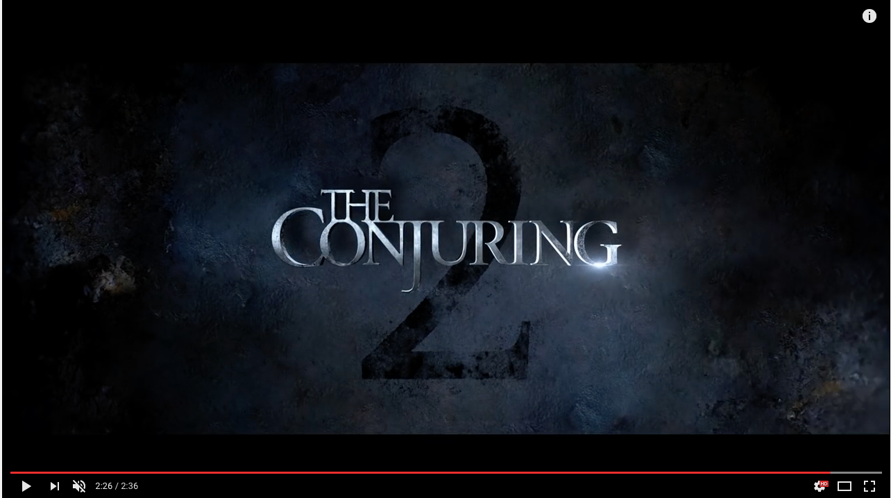
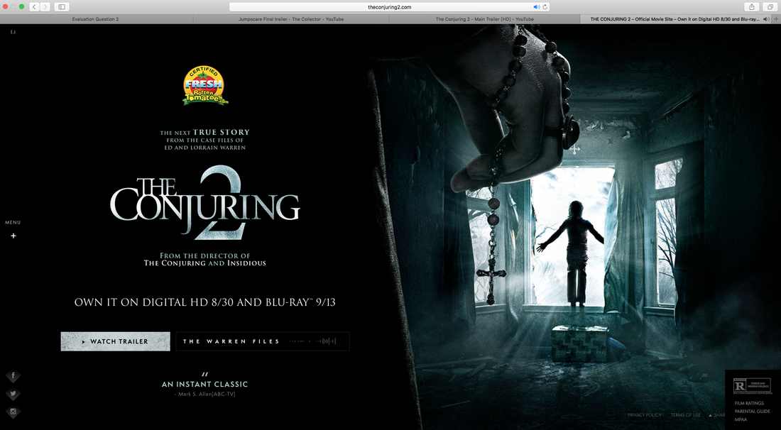
Font : The Conjuring 2 have been very careful in keeping the consistency throughout the website which is an extra media platform a lot of people tend to forget about. It continues this brand identity so when they link the two media platforms together, they know that they are both for the same film.
Colour Scheme : The colour scheme is also very consistent throughout all media platforms, they created a icy and cool feel to the colours they use in the website and In the trailer that creates a feel for the audience that makes them feel like they have to watch the film. This is an effective type of marketing for the film that brings more of the target audience in.
Characters : The characters In the teaser trailer are shown clearly in the gallery section of the website, this helps the audience feel that familiarity that they are looking for when looking at a film like this, it also helps them identify what types of personalities and characters are going to be in the actual film .
Now Ours.
|
|
Font : We have kept the same colours and font throughout all of our website that matches our trailer, this continues the brand identity that we was after and lets the audience familiarise themselves with what film it is and the tone it sets. We also thought the font was important to our brand identity as it creates the sense of a horror film throughout all media platforms that we created.
Colour Scheme : The colour scheme is important to us as a team because we knew it was essential to set a certain tone and mood to our magazine, trailer etc. Without this tone it wouldn't interest our target audience because they wouldn't know if they were going to enjoy it.
Characters : We have continued the brand identity of the characters we have in our trailer by making sure they are shown often on the website as well as our other media platforms like our poster. We didn't want our audience to go on our magazine and not remember what types of characters and personalities that were explored through our trailer, poster and magazine alone therefore we made sure they are shown constantly.
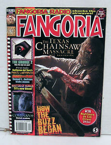
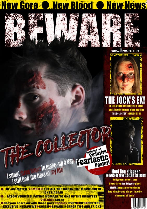
Poster & Magazine
|
|
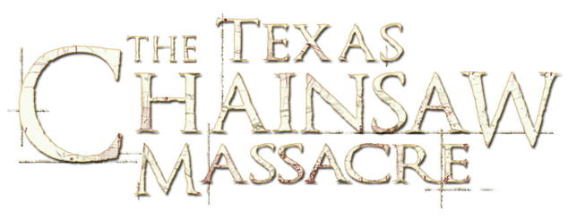
Font : Texas Chainsaw Massacre does not have the continuity of the same font and colour going all the way through their media platforms, this may be done on purpose and therefore effective in a different way, on the other hand it may have a caused a difficult problem when It comes to creating a brand identity of the film.
Colour Scheme : There is a similar colour scheme with this horror on all media platforms, for example the stereotypical contrast of red and white, this would help with the brand identity as the audience would recognise and associate the two media platforms as being the same film advertisement.
Characters : The same character is widely explored on the poster and the magazine which is the antagonist doing the killings. A lot of the horror magazines don't like to show the antagonist straight away as it is giving away who it is before the audience has even watched the film, on the other hand because this antagonist is covered up and not fully revealed. It still creates that enigma that the majority of horrors go for.
Now Ours.
|
|
Font : As you can see, we made sure we kept the same font and style of titles all throughout our media platforms however especially on the magazine and the poster. We also tried to incorporate the graphics of our film title on the magazine title, this was to keep the continuity of the titles so the target audience can Identify that these media platforms are for the same film. It also allowed us to remain a brand identity throughout all of our stages of advertising.
Colour Scheme : The colour scheme is very strict between our poster, magazine and trailer. The only colour we added was yellow into the magazine because we wanted a more vibrant colour that contrasted the stereotypical red. This was to pop out at the target audience so they would want to buy the magazine. We felt the red and white contrast worked quite well due to them being opposing colours and standing out really well, as well as following the horror colour conventions.
Characters : We also found it important to maintain the same character on both the poster and the magazine because we wanted the audience to identify the types of characters in the film and the important roles they played. We made sure we didn't include the antagonist in our poster or magazine because we didn't want to give too much away to the audience and ruin the trailer or the film.
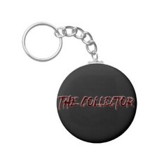
Logo - brand identity (claudene)
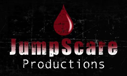
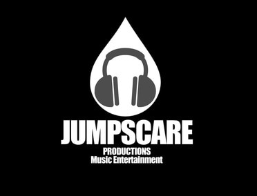
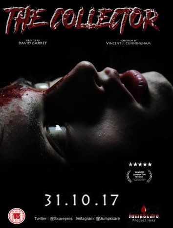
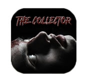
The logo for our production company. JumpScare Productions features on our Film poster, website and on our main teaser trailer. All three products features our original logo. This logo uses the colours black, red and white, these three colours have been used throughout the whole projects and has taken the effect of being part of the house style for the JumpScare productions work. This logo also uses a textured background which is also used a lot throughout our project mainly seen in the horror magazine, This effect gives it a scratchy look as if its meant to look as abnormal so that it helps distinguish brand identity among our audience. The logo also prevents others taking/ copying our products and therefore is a stamp/ symbol of copyright.
Brand Identity
A company's brand identity is how that business wants to be perceived by consumers. The components of the brand (name, logo, tone, tagline, typeface) are created by the business to reflect the value the company is trying to bring to the market and to appeal to its customers.
Successful branding of a film or franchise could be the difference between grossing $900 million at box office or grossing well under $100 million so therefore this is an important part to take into consideration when producing our products. Particularly when starting a film franchise or series, branding is everything. Brand identity is a lot to do with three key things; the name of the film, the typography used and the colours used,this all comes down to a convention called the house style. The house style is very important when coming to create other products that are linked with the main product. A strong branded film will be one that is instantly recognisable amongst its audience simply from the film titles typography.
Successful branding of a film or franchise could be the difference between grossing $900 million at box office or grossing well under $100 million so therefore this is an important part to take into consideration when producing our products. Particularly when starting a film franchise or series, branding is everything. Brand identity is a lot to do with three key things; the name of the film, the typography used and the colours used,this all comes down to a convention called the house style. The house style is very important when coming to create other products that are linked with the main product. A strong branded film will be one that is instantly recognisable amongst its audience simply from the film titles typography.
Example
|
|
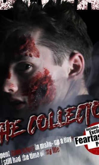
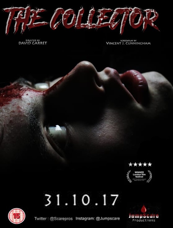
Our Product
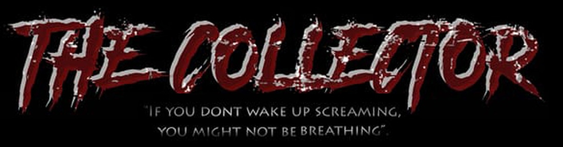
Throughout all of our final products, the film title, "The Collector", is written with the same font and also in the same colour exactly the same way. As the consistency in the house style used in the title is important when creating a strong brand, the colour is something we could adjust slightly in order to fit the colour scheme of which ever media platform it's on. The typography we have chosen we feel as if it has very strong branding and could easily be distinguished that this font is linked to the film "The Collector" therefore would work when creating sequels for example like the Paranormal Activity film franchise. For this title we took inspirations from various horror films such as "Friday 13th", "Nightmare on Elm Street" and "The Conjuring 2" as the font we have chosen has a unique shape, texture and colour.
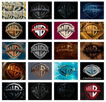
Example- Warner Brothers
|
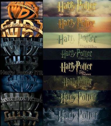
Brand identity is just as important for production companies as this allows viewers to follower up what production company made a particular film and therefore promote themselves, should have a strong logo in order to help aid and promote instant public recognition of their company. Logos are either purely graphic or are composed of the name of the organisation. A lot of logos produced by the major companies can interchange to suit the theme of the poster or wherever it may be being placed. This is important convention as allowing the logo to adapt to the poster or films that they are producing allows the theme to be strongly followed. However when changing the theme of the logo, its still recognisable as the main production company as its just simple things that are changed such as the effect, colour or background, for example the "warner Bros Pictures" adapts there logos often to suit the theme of the film.
|
|
Our Product
|
|
|
Example
|
|
For example the franchises Harry Potter uses the name 'Harry Potter' as a brand this is shown by the typography used throughout the different sequels; this is done to symbolise the theme of wizards of the film. The colour of the title is mostly as gold which could represent the wizards in this film. They have been really smart with their branding by associating everything with the same font therefore can easily be distinguished as the Harry Potter film. Their use of brand identity has been really successful due to their worldwide box office figures. Warner Brothers have also adapted their branding to fit in the theme of the film this helps with promoting the film and also shows a strong branding logo.
|
As a media conglomerate JumpScare Production has several subsidiaries. We own:
A media conglomerate, media group, or media institution is a company that owns numerous companies involved in mass media enterprises, such as television, radio, publishing, motion pictures, theme parks, or the Internet. For media conglomerates, brand identity isn't always emphasised to boast and promote the production company. Currently the largest media conglomerate in America is The Walt Disney Company. News Corp & 21st Century Fox, TimeWarner, CBS Corporation, etc.

|
JumpScare productions has shown their understanding of branding amongst media conglomerates, media groups or media institutions, as we have decided to turn our production company. JumpScare Productions, into a subsidiary of a large media corporation. Taking a lot of inspiration from existing multinational media corporation. We have done this by using the same house style throughout the subsidiary's but have adapted it slightly to fit in with that certain media platform.
|
|
JUMPSCARE PRODUCTIONS: MUSIC ENTERTAINMENT
JumpScare Productions Music Entertainment is a popular music company in the industry as they known/ popular for their great recording artists, composers, top agents and promoters. This logo is similar to the JumpScare production logo as they are linked promoters to get the film we have created on to other media platforms like music. This can include the tracks included in the film to be sung by artists that are under the same company. This can attract the audience as music is a big hit In technology therefore using someone well known to play/ sing their songs promotes the film allowing this to be looked at by a bigger audience. This logo uses brand identity as its taken the same shape of the main logo, however to promote the music entertainment there is head phones within the tear drop using the same house style. |
|
|
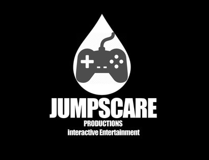
JUMPSCARE PRODUCTIONS: INTERACTIVE ENTERTAINMENT
JumpScare productions Interactive Entertainment is an industry that can create a variety of video and computer games. They could have plenty of games that are involved with the films that are produced by JumpScare Productions. This means that the interactive entertainment sector work alongside the film industry. This use of synergy increases profit sales for both media platforms. This logo uses brand identity as its taken the same shape of the main logo, however to promote the Interactive entertainment there is an video game controller shape within the tear drop using the same house style as the main JumpScare Production Logo. |
|
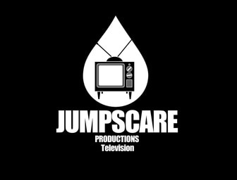
JUMPSCARE PRODUCTIONS: TELEVISION
JumpScare Productions, Television is another way to gain a profit for JumpScare Productions. The television studio could broadcasts several programmes that are popular worldwide also produced by The JumpScare Production team, this advertises us as a production company making the veiwers want to watch more films that are produced by us. In addition to this, they could also have different television channels. This logo uses brand identity as its taken the same shape of the main logo, however to promote the Television there is an TV shape within the tear drop using the same house style as the main JumpScare Production Logo. |
|
|
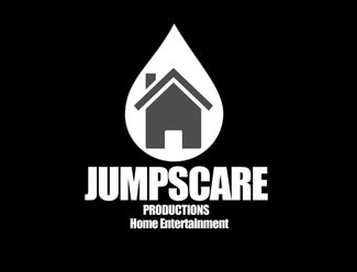
JUMPSCARE PRODUCTIONS: HOME ENTERTAINMENT
JumpScare Productions Home video entertainment is one of the biggest pre-recorded organisations. This would make profits by releasing different Jump Scare Production films on different media platforms such as Normal DVD, Blu-ray DVD, 3D DVD, Netflix, amazon prime, etc. By Streaming these films for a reasonable price on amazon prime could also give us more profit. This logo uses brand identity as its taken the same shape of the main logo, however to promote the home, video entertainment there is an house shape within the tear drop using the same house style. |
Synergy through media platforms.
Billboard & app & Netflix & ride - all claudene.
Billboard- Claudene Alberts
|
|
|
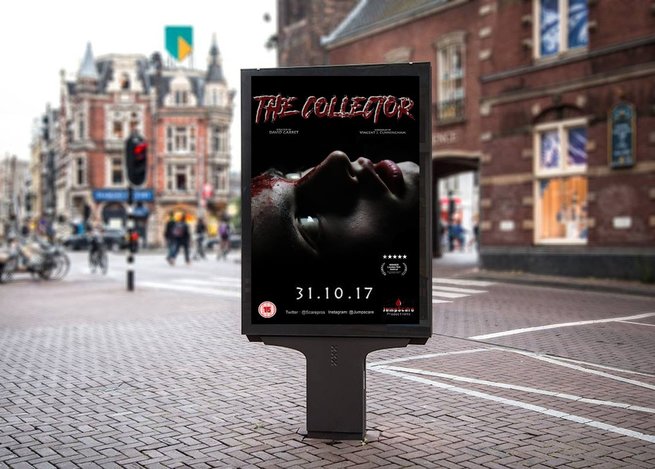
BILLBOARDS
I have created two different types of billboards, one being advertised in a billboard in a shopping town outside and a billboard that moves allowing the audience to not only see the title but some of the producers and stars that are featured. Billboards are one of the best ways to advertise as film as there are lots of people that walk/ drive past them 24/7 therefore promoting our film on something like this attracts a major audience. The poster design is like the final film poster as this uses the same continuity through the colours, typography and the dominant image. This also uses the same colour scheme such as red, white and black which also links to branding our film. |
|
Netflix- Claudene Alberts
|
|
|
NETFLIX
This gif shows, The Collector, featured on the Netflix film page under the sub-genre, Scary films. Netflix is a subscription-based movie and television show rental service that offers media to subscribers via Internet streaming and via US mail. Netflix reported global streaming subscribers at 40.4 Million in 2013. Similar to the other existing gene of horror film posters surrounding The collector film, The images that are on rotation gives a slight peak of what happens in the film, we've also given a slight summery of what happens in the equilibrium and disequilibrium so that the viewers would have to watch the film to find out the resolution. The typography used continues to use the same colours and font maintaining the continuity throughout our different products. |
|
App- Claudene Alberts
|
APP
This Gif is showing how our film's game app is featured on a list of the Top Free Games available on the Apple IPhone App Store. The other page is showing what its like if you click onto the app allowing the viewers to see what the games about before downloading it. This game has been made so that its free to download as this gives the audience a general idea to the films concept/ content and therefore is there to help advertise and promote the release of the film. the colours/ character is used throughout this to show a link between all our products which allows the audience to see that the franchise the film has. |
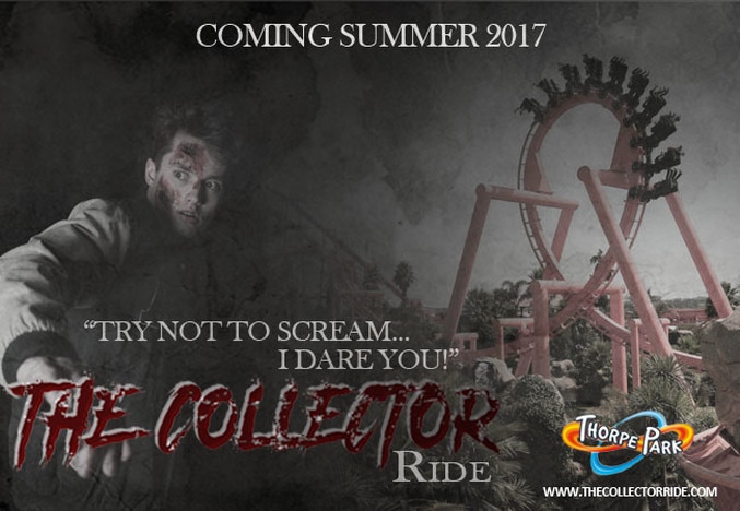
The Collector Ride- At Thorpe Park
|
RIDE
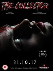
This is an advertising poster for the release of The Collector Ride, a ride that is linked through the film. This roller coaster is placed in the Thorpe Park theme park in the United Kingdom. This roller coaster is themed around our horror film and will have an experience throughout the whole ride (from the time you line up right until you leave the area of the roller coster). This experience will include props/ videos/ location set up, etc. of what its like in the film to this is also a way to advertise the film if the users of this ride have not yet watched it. Saw- The ride is currently one of the horror-film themed roller coasters which had a estimated of £13.5 million to build. The colour scheme throughout this poster heavily uses the house style used in our poster and magazine as we have mainly focused using black and red. |
|
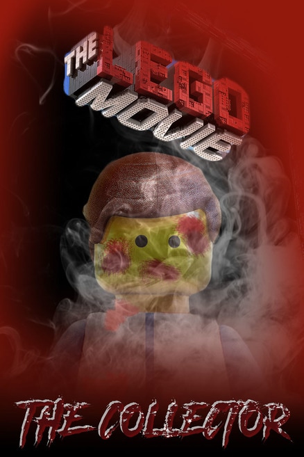
This is a poster of our film, The collector, produced with a partnership with Lego. Over the years there have been many films released in cinemas that also release a Lego movie just after for the younger audience to watch and therefore this would have certain scenes cut out so that its suitable for the younger audiences. Through this poster we have used a Lego character with wombs on his face also including "The Collector" logo/ branding at the bottom of the page to allow the audience to know that this product promotes the real movie. We have also used similar colours such as red white and black to go with the rest of the products colour schemes.
|
|
|
|
|
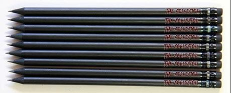
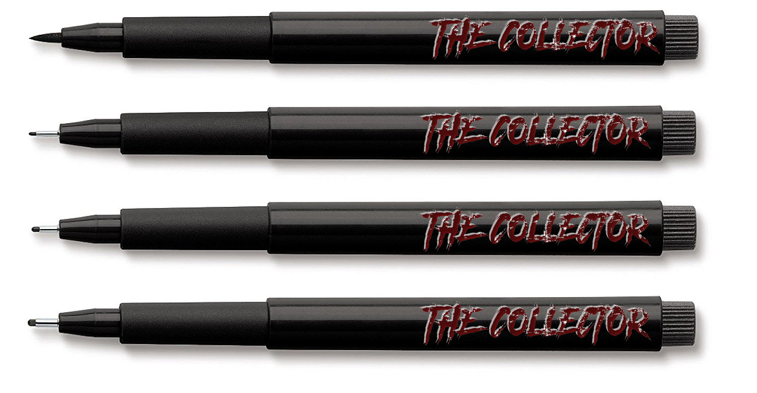
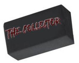
STATIONARY
|
|
|
|
Bus stop/ bus & phone case & IMDB & Cinema - all Olivia C
|
|
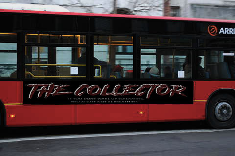
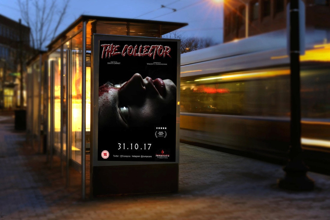
Above is our poster and title of our film on the side of buses and at a bus stop. The choice of a bus stop was because its a very common place that people go or walk past and a easy way to advertise our film. We chose to advertise the poster because we thought that it was a nice clear way to advertise to the target audience our film coming out. We chose to have just the title on the side of a bus as we felt the graphics of the title was very gripping even at a quick glance, therefore we knew the audience would capture it as the bus was driving past them.
|
|
|
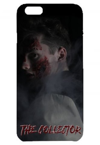
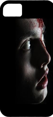
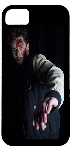
We thought a good way of merchandising was putting the popular and most consistent characters on a phone case. We chose this because we know and have learnt how popular and important technology is in this day and age and therefore a phone case of our film might be quite appealing to the target audience, especially the teenage cut of them. We used similar photos to the ones used on the poster and trailer to complete the continuity of our film and continue that brand image that we was so focused on creating.
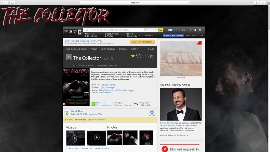
Above is a picture of our films IMDb page. Internet Movie Database (abbreviated IMDb) is an online database of information related to films, television programs and video games. We chose to advertise our film on this website because as well as it having 49 million registered users, it is listed number 50th on the list of most visited websites. We therefore knew how popular it was going to be when it came to putting a new film on there. We made sure we used the poster that we have used through many media products and we also continued to include a backgroung photo of the main protagonist to add a bit more effectiveness and creativity to the page as the target audience clicked on it.
|
|
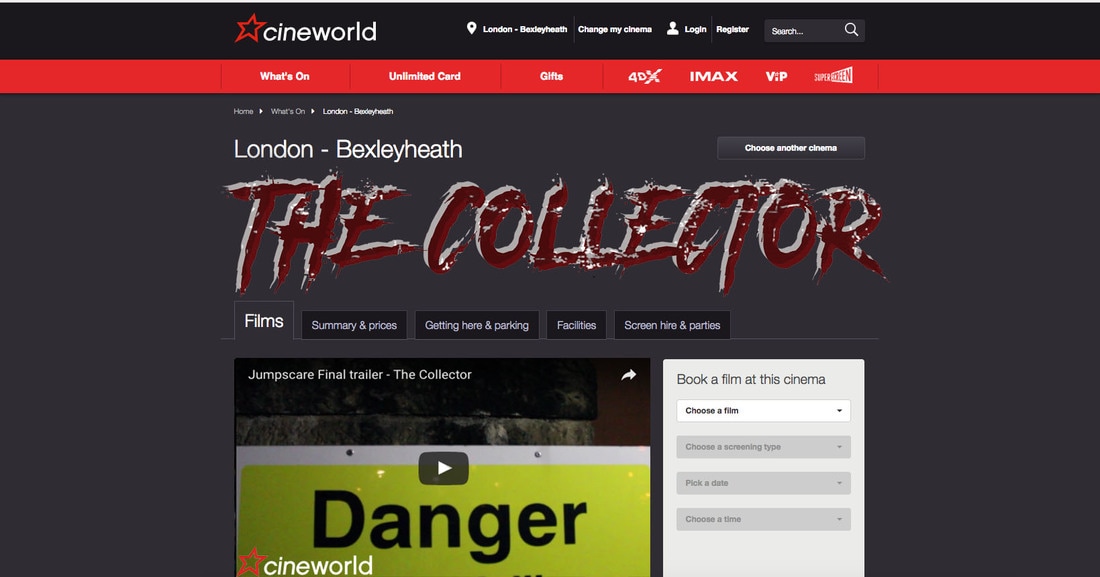
We also advertised our film on the cineworld website as it consists of 81 cinemas and we knew it was a popular way people liked to watch the film. We started by keeping the graphical title on the homepage as we knew it would be the first thing the target audience saw before they clicked to book or look into a film. We also provided our trailer to show it was ready for screenings and people could book to watch it. We kept the continuity of the characters and colour scheme to continue the brand identity throughout all advertising platforms.
Youtube & iTunes & xbox games & website - all Olivia p
Official 'The collector' XBOX ONE game and official 'The collector ' wiki page.
The official 'the collector wiki page created for the XBOX ONE game. The product keeps the themes that provide familiarity with the brand for the audience. Specifically because the main image on the games front cover is the same as the one on the poster, however it has been altered to a shade of deep red. The reason this was done was much like the reason for the franchises prior altering their familiar aspects and factors, it was done so that it could adapt and better suit the purpose of the product and perhaps even the audience. The shade of red better fits the product because it is a horror game and whilst the main image on the poster is menacing and fit for the horror genre the deep red lets the audience know that it is apart of the franchise but a different product altogether.
|
|
|
|
|
the official Xbox one game, limited edition console and online downloadable game on the xbox online store
|
The official 'The collector' YouTube
|
The official YouTube page for the collector movie, used to promote the movie, the products and update people about the upcoming projects undertaken by JumpScare Productions. The consistency in this product is limited, unfortunately YouTube pages are difficult to personalise. However, the sense of familiarity still continues in the fact that the two products are clearly made by the same company. In addition to this the trailer is also denoted on the webpage so the branding, colours themes, typography and iconography etc. still continues in the trailer. This is a product that has not been made by both of the franchises the way this product has, both of the franchises have their trailers on the YouTube streaming platform. However, currently they do not have official accounts on YouTube with which to put their trailers. Our franchise could have better brand identity and general overall branding because our products are displayed by us on platforms that assist in the advertising.
|
|
The official 'the collector' website where the public can keep up to date with the collector merchandise, the crew behind JumpScare productions, contact the company by email, view the latest publicity texts from the company and view the official trailer. With this product the franchise was able to display denotations of familiarity that reinforce the brand to better lengths than the YouTube page. For example, the page itself is the colour red, a common colour displayed through the products continuously with the products. On the first page there is also the denotation of the franchises company logo, this once again provides familiarity with the franchise.
The franchises Scream and Friday the 13th both have this assisting factor in branding with their franchises although to different degree. To elaborate, firstly Scream has multiple pages associating with the brand and much like our own product the product focuses on the movie and the products produced from the movie. Although, with the Friday the 13th website page there is a slight difference between the two. The Friday the 13th page displays news on the upcoming movie from the franchise the Scream franchise page does not do this. However, on our page we do this but by the audience/site visitor subscribing to the newsletter via email. |
|
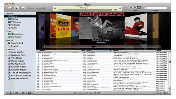
ITunes 'The collector' inspired Album front cover
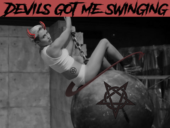
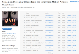
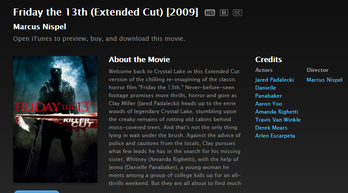
The official iTunes store 'top played playlist' featuring one of the songs from 'the collector' soundtrack, including the signature song "Devils got me singing" by Miley Cyrus. Due to the time with which it was released the first original Friday the 13th soundtrack does not currently have its own soundtrack listing, however the 2009 adaptation does. Although, both scream 1 and 2 have their official soundtrack available on the iTunes store. Once again the branding of the product strengthens our franchise and the factors are something the audience have become accustomed to.
|
|
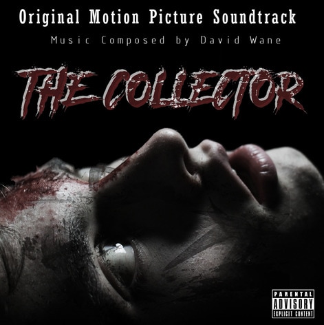
iTunes 'The Collector' Soundtrack - Vincent Cunningham

|

|
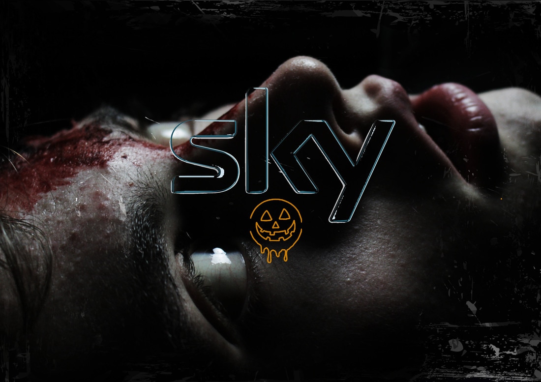
Above shows our film "The Collector" being advertised on Sky TV, a British Television broadcasting company. The season in which this movie would be released is "Halloween". I have helped audiences depict this by creating an outline of a pumpkin. I thought this was effective as this is an iconic symbol for Halloween, meaning people would be able to easily reconfigure this horror movie would be released within the Halloween series. I have edited 2 different versions of the film advertising posters onto an actual sky TV guide, to see the advertisements in action, creating a sense of realism.
|
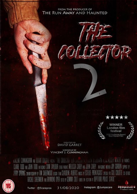
To the left is a possible sequel for our horror movie. Sequels continue the story in more detail, and also help develop characters roles. Sequels typically feature a number in there title to let audiences know this is a second film. Publishers and creators like sequels due to there known capability, they already know how well the first movie did, therefore have confidence to create a second or even third one. This breaks the risk of creating a new story line and new unknown characters that the audience have not yet reacted to. I have created a new Sequel featuring the killer on the front cover, however I have stuck to the classic conventions as i have not revealed the killer in the poster, only his weapon, a knife. I have slightly changed the layout for this horror movie poster, which i think is effective as it shows a slight change, visually helping viewers depict this may be a sequel to the horror movie.
|
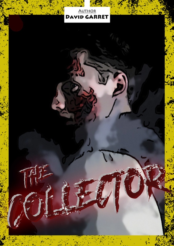
To the right is a graphic novel front cover I created. Many movies have been based on a book and vise versa. Examples of this have been the harry potter series. I decided to make a graphic novel as another form of communication. I used the same typography for the book as the film poster as they mostly share common factors to enable incidence members to recognize that it is the same film. For example I have used the same colors 'yellow' and red. I have created a cartooned image using my Photoshop skills to show audience members that this is a graphic novel, this is reinforced by the author featuring at the top of the front cover.
